| Author | Thread |
Comments Made During the Challenge  |
|
|
12/19/2009 05:38:09 AM |
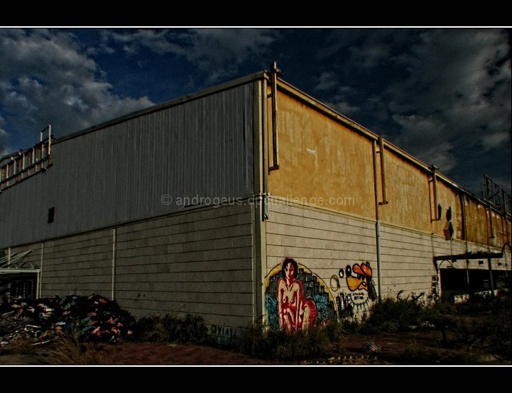
| I like the realism and the depth of the image. Though the sky seems not to match the lighting.. |
|
 Photographer found comment helpful. Photographer found comment helpful. |
|
|
12/17/2009 04:23:31 AM |
Good angle.
Like the sky.
5 |
|
| Photographer found comment helpful. |
|
|
12/16/2009 08:00:57 AM |
| The decay is evident. One issue I have with this challenge is the confusing of art with decay......6 |
|
| Photographer found comment helpful. |
|
|
12/16/2009 02:02:30 AM |
| would look better with a bit more exposure |
|
| Photographer found comment helpful. |
|
|
12/15/2009 09:18:53 AM |
| another good work.... compliments. |
|
| Photographer found comment helpful. |
|
|
12/15/2009 01:06:33 AM |
| Seems pretty dark. A slower shutter speed could have brightened this up a little. No vote, I'm in this one. |
|
| Photographer found comment helpful. |
|
|
12/14/2009 06:10:10 PM |
| I like this composition and placement of the subject. It could have stood for some curves adjustment to draw those great clouds out (push the highlights) and create better seperation for the art and wall. Good shot though. |
|
| Photographer found comment helpful. |
Home -
Challenges -
Community -
League -
Photos -
Cameras -
Lenses -
Learn -
Help -
Terms of Use -
Privacy -
Top ^
DPChallenge, and website content and design, Copyright © 2001-2025 Challenging Technologies, LLC.
All digital photo copyrights belong to the photographers and may not be used without permission.
Current Server Time: 03/12/2025 03:00:13 AM EDT.