| Author | Thread |
|
|
06/23/2004 02:18:42 PM |
What the heck, I understood your photo... -_- I don't get it, what happened in this challenge? This is a great photo that should have done much better! It especially didn't deserve 10 1s and 14 2s.
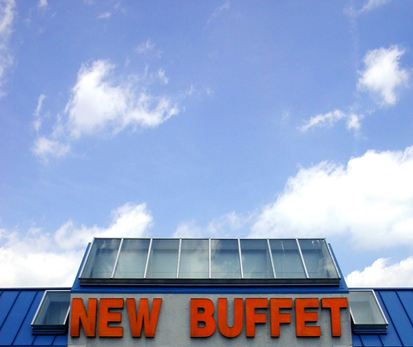
Your use of negative space/clouds & sky really draws your eye to the sign (not to mention with the red of the sign as you said). And there is nothing BAD about it at all! |
|
 Photographer found comment helpful. Photographer found comment helpful. |
|
|
06/23/2004 11:46:06 AM |
Accidently duplicated previous post.
Message edited by author 2004-06-23 11:46:58. |
|
|
|
06/23/2004 11:44:11 AM |
Originally posted by agrimace:
Sorry You didn't like my comment. I will try to be more succinct. I don't think that this represents a good choice picture since it doesn't tell the viewer what the choices are. I do like the colors and the framing of the storefront and the sky. I was not being flippant when I wrote the last comment. That is exactly what I thought you where trying to suggest. Maybe I ahve have been dieting too long. :) I certainly agree with your criticism and I will try to be more helpful from now on. |
Actually, your comment was funny and not too far off. If you had followed it with, "No, seriously..." and what you said above, I would have marked is as helpful (and wouldn't have called you out in public--sorry about that--I was extremely sleep deprived at that point).
My intention was kind of a humorous elevation of the mundane kind of choices one faces at a Chinese buffet to the major life choices we make (the expanse of celestial clouds gave me that notion). I originally titled it, "Life is a buffet, choose wisely" but in my perverse way I felt that was too direct. I have an almost pathological aversion to insulting the viewer's intelligence with leading titles. Obviously, the double-meaning was too obscure and needed the clarity of a different title.
Thanks for the follow-up!
Message edited by author 2004-06-23 11:47:29. |
|
|
|
06/23/2004 06:56:01 AM |
| Sorry You didn't like my comment. I will try to be more succinct. I don't think that this represents a good choice picture since it doesn't tell the viewer what the choices are. I do like the colors and the framing of the storefront and the sky. I was not being flippant when I wrote the last comment. That is exactly what I thought you where trying to suggest. Maybe I ahve have been dieting too long. :) I certainly agree with your criticism and I will try to be more helpful from now on. |
|
| Photographer found comment helpful. |
Comments Made During the Challenge  |
|
|
06/21/2004 04:45:30 PM |
| No choice suggested in photo |
|
|
|
06/18/2004 05:05:28 AM |
Hehe.
Great idea. Nice colors, and framing.
I like this a lot. 8. |
|
| Photographer found comment helpful. |
|
|
06/16/2004 07:07:01 PM |
|
|
|
06/16/2004 06:00:32 PM |
|
Home -
Challenges -
Community -
League -
Photos -
Cameras -
Lenses -
Learn -
Help -
Terms of Use -
Privacy -
Top ^
DPChallenge, and website content and design, Copyright © 2001-2025 Challenging Technologies, LLC.
All digital photo copyrights belong to the photographers and may not be used without permission.
Current Server Time: 03/12/2025 03:51:41 PM EDT.