| Author | Thread |
|
|
07/02/2004 12:17:57 PM |
Greetings from the Critique Club!
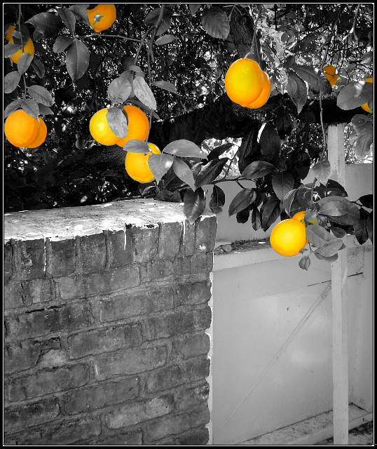
This is an interesting shot and reading your comments you wondered if people would be bothered by the stake holding the tree. From reading the comments you did receive that isn't what did bother them. I too love the idea of what you were going for, just needed some refinement. I hope you take the suggestions offered so far and try this again. Focus in on just one or two lemons, leaving the wall and gate (is that a gate?) of the shot completely.
Also reading the method you used to take the lemons out did leave a harsh line between the cut and paste area, maybe next time, if you have Photoshop, using the magic lasso to surround the lemons, then go to Select in the top line, Inverse and then desaturate the rest of the shot, then select again, inverse and you can play with the colors of the lemons a bit if you want. They have more orange in them than yellow in this shot. Your contrast and levels on the black and white are pretty good and stand out very well. Again, the idea is great and if you decide to redo this shot I would love to see the results!
Good Luck In Future Challenges!
Deannda
DNeufer@stny.rr.com if you have any questions or want to discuss this further! |
|
Comments Made During the Challenge  |
|
|
06/27/2004 01:38:30 AM |
| Great idea, and great composition, but the desaturation seems a little too hard- like there's a line around the lemons that just makes them stand out too much. I think it has much potential, just needs to be refined |
|
 Photographer found comment helpful. Photographer found comment helpful. |
|
|
06/23/2004 01:54:08 AM |
| I have a love hate relationship with this picture. Stepping back from the monitor it works, looking at it it normally doesn't. That's because the transition between yellow and orange have pixilated on you. While desaturating the picture you must have accidentally removed a hue used by the colored segment of the picture. It's a nice hight contrast picture to work with on this challenge - one liemon from the correct angle might have worked better for you. Rated 7. |
|
| Photographer found comment helpful. |
|
|
06/22/2004 11:22:44 AM |
| Too much saturation on the lemons. |
|
| Photographer found comment helpful. |
|
|
06/21/2004 06:33:58 PM |
| Not too crazy about your composition, but I do love the over all idea. Sunny yellow. Nice one, tighter crop is needed. 7 from me. |
|
| Photographer found comment helpful. |
|
|
06/21/2004 07:09:13 AM |
| The lemons don't really stand out at you, maybe a closer shot on only one or two would be better. |
|
| Photographer found comment helpful. |
|
|
06/21/2004 02:16:35 AM |
|
| Photographer found comment helpful. |
|
|
06/21/2004 01:40:36 AM |
| The edges are too sharp, looks fake. And saturation is too high, tone it down a bit. Use a smoother brush next time to get a gradient soft edge effect. |
|
| Photographer found comment helpful. |
Home -
Challenges -
Community -
League -
Photos -
Cameras -
Lenses -
Learn -
Help -
Terms of Use -
Privacy -
Top ^
DPChallenge, and website content and design, Copyright © 2001-2025 Challenging Technologies, LLC.
All digital photo copyrights belong to the photographers and may not be used without permission.
Current Server Time: 03/15/2025 05:21:55 AM EDT.