| Author | Thread |
Comments Made During the Challenge  |
|
|
01/06/2010 09:30:57 PM |
|
 Photographer found comment helpful. Photographer found comment helpful. |
|
|
01/05/2010 03:16:55 AM |
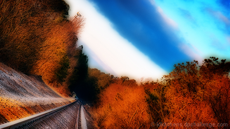
| I view this image and I prefer I did not. I really do not enjoy the processing of this image. Sure the colours pop but there is a complete loss of detail. For me the affect used did not enhance the image but rather turned it from a photograph into a digital piece. Loss of innocence is what I would say. |
|
| Photographer found comment helpful. |
|
|
01/02/2010 06:07:27 PM |
OK, I'm going through the Free Study submissions, purposefully finding those images I think are shot with a less conventional eye - this is one of those images! Thanks for offering something that isn't just DPC friendly eye-candy (though of course there's nothing wrong with eye-candy). I'll be picking one of these images for the Mu (most underrated) award:
Positives: I think the tilt really works here, especially with the placement of the rail in the bottom left corner. I quite like the coloration too.
Critical stuff: I think the softness / glow in the image is perhaps a little overdone.
Overall: An interesting picture but one that is perhaps a little over-edited. |
|
| Photographer found comment helpful. |
Home -
Challenges -
Community -
League -
Photos -
Cameras -
Lenses -
Learn -
Help -
Terms of Use -
Privacy -
Top ^
DPChallenge, and website content and design, Copyright © 2001-2025 Challenging Technologies, LLC.
All digital photo copyrights belong to the photographers and may not be used without permission.
Current Server Time: 03/12/2025 07:43:02 AM EDT.