| Author | Thread |
|
|
01/30/2010 11:15:58 PM |
| I would choose this one because your crop keeps the focus on the sign, although I'd like to see it a tad brighter like the other. |
|
 Photographer found comment helpful. Photographer found comment helpful. |
|
|
01/27/2010 09:20:20 PM |
| Although I like this one better it does not really work for me. I think it would have if it was a tight crop with just the squiggly lines, perhaps with even more blur. Funny story about the sign! |
|
| Photographer found comment helpful. |
|
|
01/21/2010 10:07:20 AM |
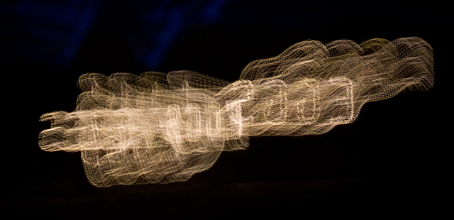
Interesting and works.
Even a tighter crop would do; or a coupling with some other subject around it. |
|
| Photographer found comment helpful. |
|
|
01/19/2010 12:11:53 AM |
| I think that I like this one better. I like the neutral tone and the closer crop. |
|
| Photographer found comment helpful. |
|
|
01/18/2010 04:55:25 AM |
this one is a little more legible only just tho
i gather your topic is abstract for this one?
if so its really worked well |
|
| Photographer found comment helpful. |
|
|
01/18/2010 03:49:14 AM |
| I prefer this one - colour distracts. What it's distracting from is anyone's guess, but this abstract has some depth and a consistent form, so it looks complete and deliberate without having to 'be' anything... |
|
| Photographer found comment helpful. |
|
|
01/17/2010 11:24:28 PM |
| I also prefer this one better the brightness detracts from the first one. |
|
| Photographer found comment helpful. |
|
|
01/17/2010 11:19:02 PM |
I like this one better. I think the interest of the photo is the shape and the blur.
Adding the contrast doesn't add much and, IMO, might even detract from your standout design here. |
|
| Photographer found comment helpful. |
Home -
Challenges -
Community -
League -
Photos -
Cameras -
Lenses -
Learn -
Help -
Terms of Use -
Privacy -
Top ^
DPChallenge, and website content and design, Copyright © 2001-2025 Challenging Technologies, LLC.
All digital photo copyrights belong to the photographers and may not be used without permission.
Current Server Time: 03/15/2025 03:12:15 AM EDT.