| Author | Thread |
Comments Made During the Challenge  |
|
|
06/27/2004 06:51:18 AM |
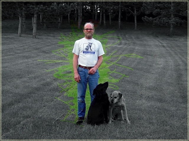
| Clever idea to get the idea of painting colour onto the photo but might have worked better with thicker brush and more even brush movement |
|
|
|
06/26/2004 08:51:00 PM |
| Kudos for the bold and unique use of desaturation. Distracting at first but I love the creativity and different technique. |
|
|
|
06/24/2004 06:39:56 PM |
| this is a great, creative use of dsat. the border works well, the scratchy green is interesting... trees provide a good background - perhaps a bit too much negative space on either side of the professional models |
|
|
|
06/24/2004 01:39:19 PM |
| I think your picture would look great if just the person and dogs were in color, |
|
|
|
06/24/2004 03:08:36 AM |
Interesting choice of what to desat and what not. I personally don't care for it. I think it would have worked better if the dogs were not desaturated and you framed them in the green also.
TC |
|
|
|
06/24/2004 12:14:26 AM |
I don't know what your intent was in this. Did you plan on leaving all the green "coloring outside the lines" trails?
It looks like you may have to calibrate your monitor to me.
Have you looked at this shot on someone else's monitor? |
|
|
|
06/23/2004 09:20:19 PM |
| I'm not sure what you are telling me with this desaturization. You've done a good job on the model, but I really don't like the grass. I'd also suggest you don't place your subjects dead center, unless there's a reallly good reason to do so. |
|
|
|
06/22/2004 12:28:22 PM |
| This is an unusual method of selective desaturation but it looks great. Very nice effect :) |
|
|
|
06/22/2004 12:08:59 PM |
| LOL! Funny. But take out the color on the man too, I think. Why have the man in color but the dogs in black and white? |
|
|
|
06/22/2004 10:50:30 AM |
Nice centered composition, but I don't think the brush work you did here is necessary, you could have stopped at the outlines of the person.
Good luck... |
|
|
|
06/22/2004 10:22:24 AM |
| This is a nice shot of RT and his dogs but the post processing looks like it got a bit messy, as I'm sure you have probably heard. There is so much chaos surrounding RT that it really distracts from the subjects. Maybe if RT was kneeling on the grass with his dogs and you just left his jeans or maybe the dogs, okay, not the black one, that would be an excerise in futility :) But you could bring the cropping in tighter if he was kneeling, taking out the trees in the back, they are more distracting to me, making RT and the dogs the main focus of the shot. A 4 as is |
|
|
|
06/22/2004 06:32:18 AM |
its weird but I like it. Very intersting to see you've coloured a bit of the grass but not followed a natural line.
I really like it infact but knowing DPC sensibilities lots won't.
I'd have liked to see a bit more colour in the dogs and less on the man (I like dogs more than humans!!)
Gets an 8 from me |
|
|
|
06/21/2004 12:06:34 PM |
| Why did you color in the grass? |
|
|
|
06/21/2004 08:00:01 AM |
| I'm not fond of the saturated grass patteren, it's a brave choice for a challenge, which I admire, but for me it doesn't work. |
|
|
|
06/21/2004 03:55:53 AM |
| cute dogs. im not a fan of the very abstract looking squiggles of color behind 'RT' though, i think it detracts from the image. if RT was the only thing in color i think the picture would look substantially better. |
|
|
|
06/21/2004 03:06:28 AM |
| Not sure I understand what's going on in the grass. Meets the challenge but boy am I confused. |
|