| Author | Thread |
|
|
02/01/2010 01:36:00 PM |
Greetings from the Critique Club.
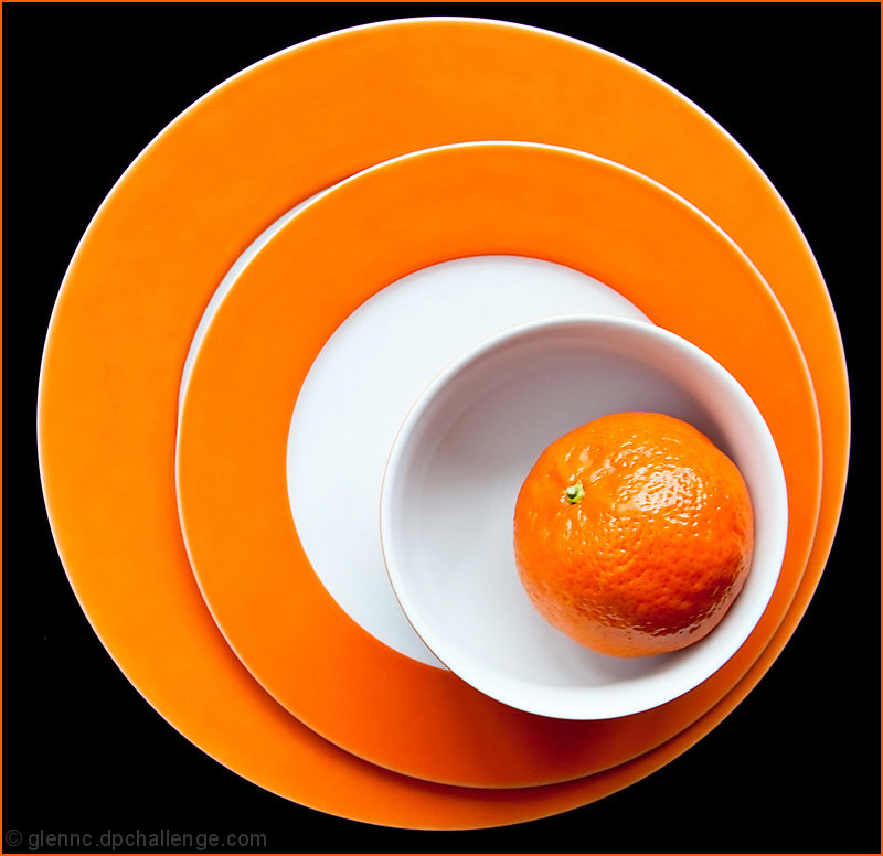
First impressions are that the oranges together with the circles reducing in to the orange make a pleasing shot.
Technically this is good. I'd have preferred the crop to be either wider such that the plates aren't crammed in so much or tighter so that the large plate is not fully visible. As it is there is a slight feeling of claustrophobia. I will say that the lighting does seem a bit harsh.
Artistically this is good but you know that this works well from your PB shot. I wonder if these are the same plates with a hue change?
In summary this is a good shot but the top 10 placing tells you that. Good work.
Feel free to PM me if you have any queries.
Gerry
Message edited by author 2010-02-01 13:51:50. |
|
 Photographer found comment helpful. Photographer found comment helpful. |
|
|
02/01/2010 09:06:53 AM |
| congrats on your top 10!! What a fun shot! |
|
|
|
02/01/2010 08:21:27 AM |
| What a refreshing, great idea for still life. That slick black background is such a nice compliment to the vibrant color. Congratulations on 9th place. |
|
| Photographer found comment helpful. |
|
|
02/01/2010 04:51:41 AM |
| Great composition, congrats! |
|
| Photographer found comment helpful. |
Comments Made During the Challenge  |
|
|
01/31/2010 10:40:39 PM |
|
|
|
01/31/2010 10:02:12 PM |
| Striking geometry, very different than the old Dutch painter approach to still life. High score for graphic quality and originality, minor deduction for slight glare. |
|
| Photographer found comment helpful. |
|
|
01/30/2010 10:15:09 PM |
| Nice fruit, nice image -- excellent modern looking desing, nice rich orange colors (Comment only, no vote) |
|
| Photographer found comment helpful. |
|
|
01/29/2010 05:30:00 PM |
|
|
|
01/29/2010 02:43:26 PM |
| clean, a bit too much geometry but i like it! |
|
| Photographer found comment helpful. |
|
|
01/29/2010 01:31:05 PM |
Love those plates! Very nice setup, reminds me of  h2's work. h2's work. |
|
|
|
01/28/2010 06:39:47 PM |
| More promotional than "still life" maybe, but very striking and attractive. Eye candy. |
|
| Photographer found comment helpful. |
|
|
01/28/2010 04:30:42 PM |
| This would make a nice stock photo. Wish the bit of white showing on the bottom plate wasn't visible...it's throwing the symetry off a little. |
|
| Photographer found comment helpful. |
|
|
01/28/2010 12:23:44 AM |
| This photo balances the colors well. |
|
| Photographer found comment helpful. |
|
|
01/27/2010 11:47:46 AM |
| Nice composition, color and focus. |
|
| Photographer found comment helpful. |
|
|
01/27/2010 12:35:53 AM |
Great colours. The shot reminds me of one by Eyewave, or h2 now, so I'm guessing it's you? or maybe not haha.
Anyways, I gave this a 9. |
|
|
|
01/26/2010 10:30:07 PM |
| I love the composition and color, but the highlight on the orange is a little bit disturbing for me. Top 3. 7 |
|
| Photographer found comment helpful. |
|
|
01/25/2010 05:51:32 PM |
| Great job - I like this very much! |
|
|
|
01/25/2010 04:09:13 PM |
|
|
|
01/25/2010 09:01:22 AM |
| like it. light could be a bit more even, though |
|
| Photographer found comment helpful. |
|
|
01/25/2010 06:51:05 AM |
|
|
|
01/25/2010 05:52:12 AM |
| I've been out of it a bit so noticed my scores cast are rather lower than received sooo I thought I'd better rush through and do some voting and not worry about comments.....but I've got to on this very striking and wonderfull photo.... very well done indeed. |
|
| Photographer found comment helpful. |
|
|
01/25/2010 12:18:36 AM |
| god, except I wish the orange was in better focus...love the punchiness though 7 |
|
| Photographer found comment helpful. |
Home -
Challenges -
Community -
League -
Photos -
Cameras -
Lenses -
Learn -
Help -
Terms of Use -
Privacy -
Top ^
DPChallenge, and website content and design, Copyright © 2001-2025 Challenging Technologies, LLC.
All digital photo copyrights belong to the photographers and may not be used without permission.
Current Server Time: 03/10/2025 03:04:37 PM EDT.