| Author | Thread |
|
|
02/01/2010 02:03:09 PM |
Greetings from the Critique Club.
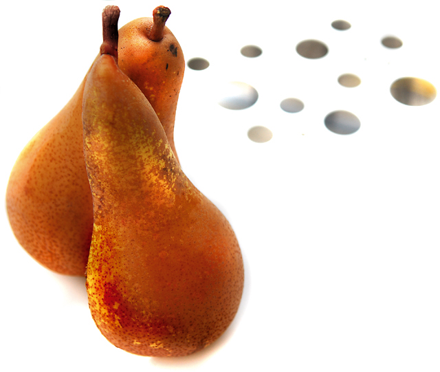
First impressions are that the shot is nice and crisp with some intrigue. Once I view for longer I start to see the issues.
Technically the composition is good but it's those dot things that balance the shot. The pears are a little too close to the left edge. The lighting is good in that is has the pears against a crisp white background but this is a double-edged sword in that it also makes the shot seem a bit sterile.
Artistically those dot things confuse us viewers. How do they relate to the fruit? Is this an "artistic" element?
In summary this has some really good points but I think the average voters was confused by those dots and the sterile feel.
Feel free to PM
me if you have any queries.
Gerry |
|
 Photographer found comment helpful. Photographer found comment helpful. |
Comments Made During the Challenge  |
|
|
01/31/2010 12:06:11 AM |
| I like the pears and their positioning. Cute title to match. What the heck is that in the upper-right?! |
|
| Photographer found comment helpful. |
|
|
01/28/2010 10:55:59 AM |
| Don't see the reason for the dots. Ad a little balance to the comp, maybe, but pretty out of place, IMO. |
|
| Photographer found comment helpful. |
|
|
01/27/2010 11:50:53 AM |
| Very appealing composition and the front pear is glowing! |
|
| Photographer found comment helpful. |
|
|
01/25/2010 07:49:36 PM |
| the dots pull my eye away from the pears |
|
| Photographer found comment helpful. |
|
|
01/25/2010 05:48:18 PM |
|
| Photographer found comment helpful. |
Home -
Challenges -
Community -
League -
Photos -
Cameras -
Lenses -
Learn -
Help -
Terms of Use -
Privacy -
Top ^
DPChallenge, and website content and design, Copyright © 2001-2025 Challenging Technologies, LLC.
All digital photo copyrights belong to the photographers and may not be used without permission.
Current Server Time: 04/02/2025 12:51:08 AM EDT.