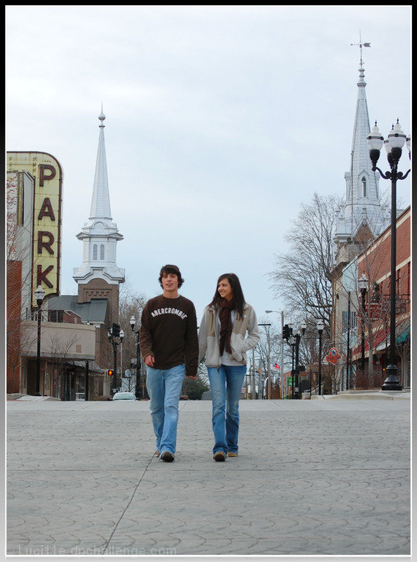
My son and his girlfriend helped me out with this and that was a challenge in itself because he hates to have his picture made. I was trying to convey "small town main USA". Our Main St. and Court Square really have that cozy feel to it especially since they renovated it a few years ago....buried the lines, added old style street lights, re-did some buildings, etc. I also think the steeples in the background add to this feel as well as the old Park Theater sign.
natural light (storm theatening late afternoon)
slight adjustment to temp. and saturation as well as the exposure and contrast
crop
boarder
re-size and save
Statistics
Place: 53 out of 81 Avg (all users): 5.2085 Avg (commenters): 5.0000 Avg (participants): 5.3095 Avg (non-participants): 5.1865 Views since voting: 782 Views during voting: 402 Votes: 235 Comments: 5 Favorites: 0
I've read your profile page, and I'll try to give a comment that can help you :)
Also, don't be discouraged by the low score on Hot, the best photographers on this site have some photos that are absolutely terrible, but it's normal that this happens once in a while.
Your photo:
Composition
Vertically speaking, the shot is well balanced.You got them in a level that is appealing regarding street level. Sideways however, the lamppost on the right seems a bit off, as well as the leading lines on the sidewalk.
I would have liked to see this shot if you moved a bit to your left, to take the post out of the equation, allowing as well for the white tower on the back to be seen.
And as difficult as it is to get your son to appear in a photo :) it would be better if they both were looking at the camera, or alternatively at each other.
Processing
Since the day was a bit cloudy, more contrast was needed, to make a stronger point.
Boosting just a tad the reds would also have created a warmer feeling.
Overall
A 5+ score, so actually above / in-line with the average, and a good start for DPC. Next try to create a real focus point to grab viewers. If the point is to enhance the people, make them "act" for the camera, or wait for a great pose. If it is the architecture, shot from below upwards.
If you have any questions feel free to contact me.
Regards,
Joao
Thanks for the comments!
Nuzzer - I was trying, poorly I guess to frame the couple with the steeples. But your point of "competing features" is well made.
rafamuffingirl - your comment made me study my photo; I studied and studie and ran it by about 4 people till I realized that the faces of the couple just, even though in focus (imo) just really arent' as sharp as they could be. Thank you espically for making me STUDY my photo!
libery - thank you :-) very much
When I read the title I immediately start singing! Nice shot, good DOF, good POV, poor composition - the two towers dwarf the people and become a competing feature