| Author | Thread |
|
|
01/30/2010 07:39:57 PM |
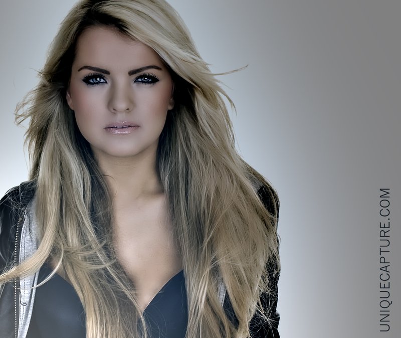
| This one has much more of an artsy look to it. I like the smoky look to it -- can you retain that smokiness yet lighten it up just a tiny bit? |
|
 Photographer found comment helpful. Photographer found comment helpful. |
|
|
01/30/2010 04:57:40 PM |
| It makes her look as though she is behind glass. I would like this one better if it didn't have the "glare" effect to it because I really think the color is better in this one. |
|
| Photographer found comment helpful. |
|
|
01/29/2010 06:15:46 PM |
| Definitely the other one. This one I don't like. The effect looks more like a bad exposure than anything else and the bright spot at the bottom does nothing to lead the eye. |
|
| Photographer found comment helpful. |
|
|
01/28/2010 08:36:30 AM |
| I like this edit too. It gives it an edginess the other one doesn't have. Amazing what a change of overall color will do. :) |
|
| Photographer found comment helpful. |
|
|
01/28/2010 07:28:06 AM |
| I think this one is too dark. I prefer the other one. |
|
| Photographer found comment helpful. |
|
|
01/28/2010 06:46:14 AM |
| nice lighting here and the smoky look is in my view the better |
|
| Photographer found comment helpful. |
Home -
Challenges -
Community -
League -
Photos -
Cameras -
Lenses -
Learn -
Help -
Terms of Use -
Privacy -
Top ^
DPChallenge, and website content and design, Copyright © 2001-2025 Challenging Technologies, LLC.
All digital photo copyrights belong to the photographers and may not be used without permission.
Current Server Time: 04/22/2025 03:44:10 PM EDT.