Hi Joshua, greetings from the Critique Club!
As to your photo:
Composition
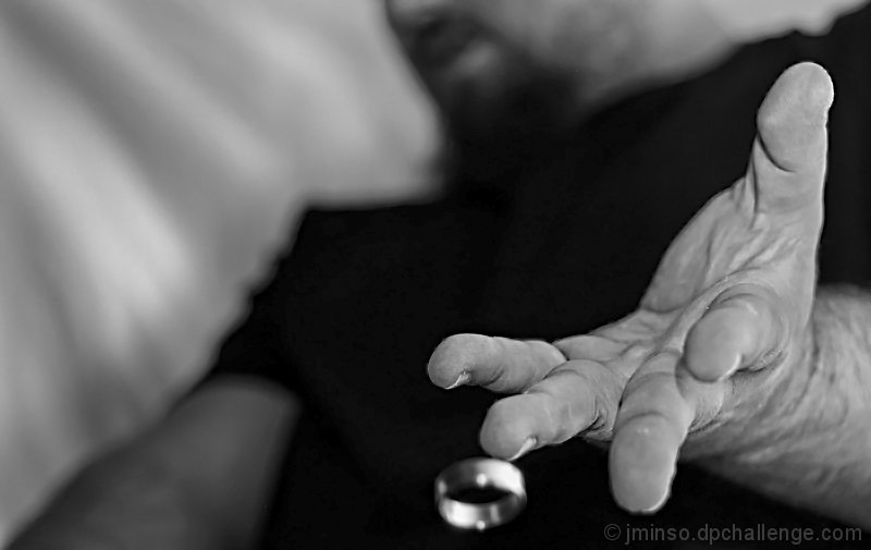
The crop is just a little tight, you could have left a bit more space below the ring, so you could really feel the emptiness you tried to convey in your photo / title.
Still, I love the angle and the fact that you can still see your face.
Lighting / Technique
The lighting and texture of the shot is very balanced, and the work that you did with the sheet, etc really paid off, you removed all distractions that could have been there and just kept it to the photo.
If you already where considering doing this in black and white, I would have increased the ISO a lot, so you could sacrifice aperture. The f/2.8 is really too open to get both the hand and the ring in focus, and I think this was the main reason people did not vote higher, as they were connecting the ring with the hand.
Processing
The conversion to b&w is very well done, great contrast and great blacks. No noise here, and a very smooth photo. Something funky is going on in the top of the hand, seems like CA but in b&w, probably due to the clarity enhance in Topaz.
Overall
A very meaningful shot, that goes beyond the photo and has a deeper meaning, that could be improved with some minor tweaks.
If you have any questions feel free to contact me.
Regards,
Joao |