| Author | Thread |
Comments Made During the Challenge  |
|
|
11/23/2002 09:22:00 PM |
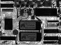
| love the colors and the idea. would like to see the foreground in sharper focus. but like the rest of the use of dof. |
|
|
|
11/22/2002 03:52:00 PM |
Excellent! This one definately draws the draws the eye to scan the "terrain"! Well done.
|
|
|
|
11/22/2002 11:53:00 AM |
| Nice affect. Maybe should have adjusted so that on even plane, I feel like I'm leaning. I think we should keep titles, this definitly adds to your pic. |
|
|
|
11/22/2002 09:19:00 AM |
Great colour - and it really is representative of a city skyline...
8, Kavey
Sun 24th bumping to 9, Kavey |
|
|
|
11/20/2002 09:56:00 PM |
| Nice shot good color. Captured a moment here. I like this. |
|
|
|
11/20/2002 08:36:00 PM |
| It looks like your camera wasn't level when you took this photo. Maybe the board is warped? If you could rotate it a degree or two, I would be happier, not that my happiness matters to you :) |
|
|
|
11/20/2002 05:26:00 PM |
| Clever idea, interesting lighting. Meets the challenge. Good luck! Grayce |
|
|
|
11/20/2002 12:23:00 PM |
|
|
|
11/19/2002 09:28:00 PM |
| You could have used depth of field to really get a sense of the components as buildings. Nice colors. |
|
|
|
11/19/2002 06:47:00 PM |
| Great use of DoF, really does look like buildings. |
|
|
|
11/19/2002 04:29:00 PM |
|
|
|
11/19/2002 03:08:00 PM |
| I really like this shot. I can hear the 'it's out of focus' comments right now but this is a great example of how selective focus can improve a shot. Seems to be rotated a bit from horizonta - the foreground slopes to the right but it's very minor. Here's to a good score. |
|
|
|
11/19/2002 09:24:00 AM |
| i like photo and th title ! |
|
|
|
11/18/2002 11:33:00 PM |
| LOVE the color and DOF ! Shiiizzzam |
|
|
|
11/18/2002 10:30:00 PM |
| Great idea, horizon's a little tilted though. |
|
|
|
11/18/2002 09:29:00 PM |
| I had a similar idea for the challenge. hehe. Well shot, good focus and lighting. |
|
|
|
11/18/2002 09:05:00 PM |
| The lighting for the subject is, how do I say it...goofy. I suppose it works for the city theme, but it's a stretch to me. Overall not bad, though. |
|
|
|
11/18/2002 07:42:00 PM |
| Cool. Job well done. Justine |
|
|
|
11/18/2002 07:33:00 PM |
| neat hue to the tech city |
|
|
|
11/18/2002 05:21:00 PM |
| LOL. Nice use of turning the subject into something else. Very well done. |
|
|
|
11/18/2002 03:32:00 PM |
great idea well executed.
only nit pick is the slight tilt to the frame. |
|
|
|
11/18/2002 02:38:00 PM |
| I like very much this techsunset! |
|
|
|
11/18/2002 10:36:00 AM |
| Love the point of view and warm colors. It's maybe a tad too redish and not quite horizontal according to my eye. 7 Lisa |
|
|
|
11/18/2002 08:20:00 AM |
| Nice idea and good colour. Needs a better DOF. |
|
|
|
11/18/2002 04:44:00 AM |
| Not sure I like the short DOF here or the reddish tone of the pic. Not poorly taken, but not real well either. Good Luck - Inspzil |
|
|
|
11/18/2002 01:10:00 AM |
| cool idea...better depth of field or different lighting may have pulled it together a little better. |
|
Home -
Challenges -
Community -
League -
Photos -
Cameras -
Lenses -
Learn -
Help -
Terms of Use -
Privacy -
Top ^
DPChallenge, and website content and design, Copyright © 2001-2025 Challenging Technologies, LLC.
All digital photo copyrights belong to the photographers and may not be used without permission.
Current Server Time: 03/12/2025 07:27:45 AM EDT.