| Author | Thread |
|
|
07/07/2004 02:46:49 AM |
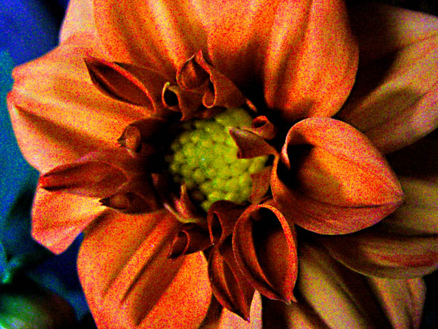
| I think your flower stands out original. The dots are wonderful they add a spice to the wholesome view and the lighting with the contrast in color oh well that is just my thought. |
|
Comments Made During the Challenge  |
|
|
07/06/2004 02:08:19 PM |
| This is so richly textured in your post-processing! Love the effect! It seems it has enough contrast to carry off this technique. The blue of the flower(?) next to it is a nice contrast, but I think the green in the corner detracts. Nice, overall. |
|
|
|
07/06/2004 05:24:55 AM |
| ISO 1600+? Looks like the shoot was way too dark, then you used levels to bring light from darkness, so noise is extreme, more than a correct exposure under ISO 6000! But the effect, even if it was not intended, is nice, like puntillism (the noise is of "good quality" if you understand me) |
|
|
|
07/03/2004 08:46:11 PM |
| Not quite sure why it is pixalated like it is. Makes it stand out, but seems too abstract. |
|
|
|
07/03/2004 03:08:36 PM |
| Rather have seen it clean and clear. |
|
|
|
07/03/2004 02:50:58 PM |
| Not sure about the grain/noise... I think a cleaner shot would have fared better. |
|
|
|
07/02/2004 08:12:39 PM |
| I like the grain here. It work for this shot. |
|
|
|
07/02/2004 11:50:13 AM |
| The grainy "texture" gives it a original (extraordinary look). Since you are started why not giving it a more colorsaturation. |
|
|
|
07/01/2004 10:08:08 PM |
|
|
|
06/30/2004 11:44:55 PM |
| this is a bad picture. way too much noise, blurry, |
|
|
|
06/30/2004 08:28:18 PM |
|
|
|
06/30/2004 03:45:20 PM |
There's a lot of noise in your photo.
Try Neatimage, this could help you. |
|
|
|
06/30/2004 01:31:28 PM |
| I like the image. The comp is good but possibly a bit too centered. Colors are great. The image seems a little noisy to me. Could you clean it up with Neat Image or some such? I actually like he noise on the petals but the noise on the blue is a bit distracting. Another possibility would be to trim a bit off the left ... eliminate the blue and adjust the over centered comp all in one go. Still a beautiful image and worthy of recognition. Good luck. |
|
|
|
06/30/2004 01:15:39 PM |
| Sorry, the tight DOF and grain don't work for me on this shot. Seems the center of the flower should be in focus as well. Everything looks like it was splattered with paint. |
|
|
|
06/30/2004 07:23:58 AM |
| too much photoshop? Colors look too saturated. |
|
|
|
06/30/2004 12:54:49 AM |
| hmmm... i'm sure you'll hear this alot.. too noisy.. did you add too much saturation? |
|
Home -
Challenges -
Community -
League -
Photos -
Cameras -
Lenses -
Learn -
Help -
Terms of Use -
Privacy -
Top ^
DPChallenge, and website content and design, Copyright © 2001-2025 Challenging Technologies, LLC.
All digital photo copyrights belong to the photographers and may not be used without permission.
Current Server Time: 03/12/2025 02:18:57 PM EDT.