| Author | Thread |
|
|
02/26/2010 09:54:16 PM |
Hi, Critique Club here...
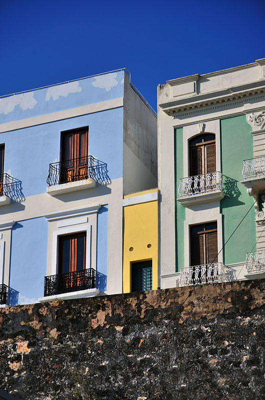
The colors are great in this image, I really like the buildings and how the colors work with one another and how they play off the terrific blue sky. The exposure is right on, and sharpness is right there as well.
A couple commenters talked about the lower third of the image being a distraction, and I agree. I think it might have made a full point difference in your score if it had been cropped 90% out. Maybe there was a reason why you didn't, but without knowing the scene it would seem to me that this would have been a better shot in landscape to show more of the great architecture rather than in portrait showing the wall.
Hopefully this was helpful. |
|
Comments Made During the Challenge  |
|
|
02/23/2010 07:46:15 PM |
| A feast of color here. I like it. |
|
|
|
02/20/2010 11:52:09 AM |
| I love this. The angle is great. |
|
|
|
02/19/2010 03:02:00 PM |
| I find that wall(?) at the bottom to be very distracting. I feel it should have been cropped out as much as possible leaving just the very edge of it in the photo |
|
|
|
02/19/2010 09:54:18 AM |
| That little house is so cute! It looks as if it has a face :D This could have had a better crop but I love the colours. |
|
|
|
02/18/2010 04:04:51 AM |
| Nice colours. Could have cropped the bottom |
|
|
|
02/17/2010 09:02:02 PM |
| If it weren't for the title, I'd have missed it! Cute! |
|
|
|
02/17/2010 12:24:30 AM |
| the bottom 1/3 of the immage almost seems pasted on, though i know its not |
|
 Photographer found comment helpful. Photographer found comment helpful. |
Home -
Challenges -
Community -
League -
Photos -
Cameras -
Lenses -
Learn -
Help -
Terms of Use -
Privacy -
Top ^
DPChallenge, and website content and design, Copyright © 2001-2025 Challenging Technologies, LLC.
All digital photo copyrights belong to the photographers and may not be used without permission.
Current Server Time: 04/28/2025 09:05:27 AM EDT.