| Author | Thread |
Comments Made During the Challenge  |
|
|
11/22/2002 11:24:00 PM |
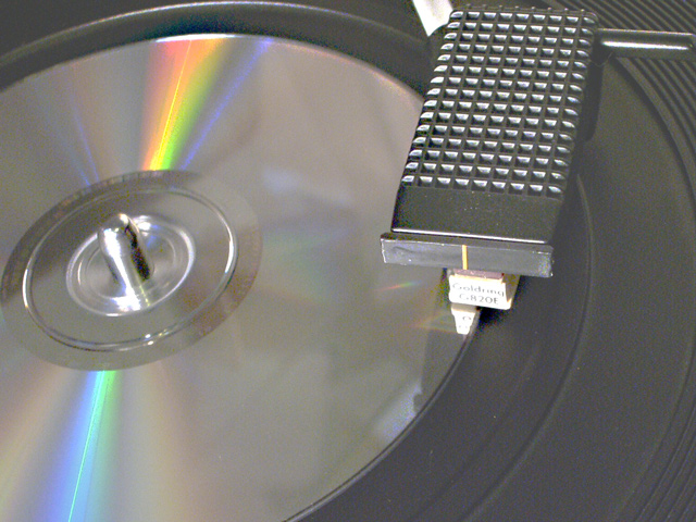
| So clever and original! Lots of cd pictures but this one made me chuckle. Whoever you are....brilliant idea, and well executed. I must point one distraction out, however. The white thing at the top of the image, over the stylus arm. A slightly different perspective could cut that out. Really good pic anyway though. Congrats. Grayce |
|
|
|
11/20/2002 09:27:00 PM |
| Need to use a higher F number for more focus. Good idea. |
|
|
|
11/19/2002 06:15:00 PM |
| It's people my age that are the confused one. My victrola won't play these. Maybe I don't have it cranked enough? Your sense of humor with this challenge is refreshing. We need more of it. Photo ain't bat either. Love the light streaks on the dics. Others will probable find that as fault but I like it. Good soft focus really works on this one. I like the crop job. (A crop job to us was cropping off our tailpipes on our old cars to make them louder) Good shot technically and the humor adds points itself. Thanks for the fun. PTLl |
|
|
|
11/19/2002 01:02:00 PM |
| Hehehe, nice idea. Reminds me of my picture. =) |
|
|
|
11/18/2002 08:42:00 PM |
| That won't work! ha ha! Nice idea. Jacko |
|
|
|
11/18/2002 05:56:00 PM |
| This picture is a nice use of the challenge. I like the idea. I also like the reflection off the CD. However, it seems a little washed out to me. Maybe a little more contrast would have been nice. |
|
|
|
11/18/2002 05:16:00 PM |
| Funny! Too bad the color is somewhat washed out. The rainbow on the CD is great, though. |
|
|
|
11/18/2002 02:38:00 PM |
| A bit more contrast so that the grays didn't all run together would have made this shot totally awesome. It is still great, I just have that one little nit-pick about it. 10 karmat |
|
|
|
11/18/2002 07:45:00 AM |
| Looks soft. Could be the focus or the compression |
|
|
|
11/18/2002 05:24:00 AM |
| The whole image is a little grainy. Looks like a little despeckle wouldn't hurt either. It's a pretty good idea, but there is some areas that just aren't as crisp as they should be. Good luck - Inspzil |
|
|
|
11/18/2002 04:40:00 AM |
| The CD seems over saturated and slightly out of focus. Nice original idea though. |
|
|
|
11/18/2002 01:37:00 AM |
|
Home -
Challenges -
Community -
League -
Photos -
Cameras -
Lenses -
Learn -
Help -
Terms of Use -
Privacy -
Top ^
DPChallenge, and website content and design, Copyright © 2001-2025 Challenging Technologies, LLC.
All digital photo copyrights belong to the photographers and may not be used without permission.
Current Server Time: 03/12/2025 02:38:41 PM EDT.