| Author | Thread |
|
|
03/27/2010 10:53:43 PM |
| Brilliant. (Your 5.5 is at least an 8). |
|
|
|
03/08/2010 04:31:49 PM |
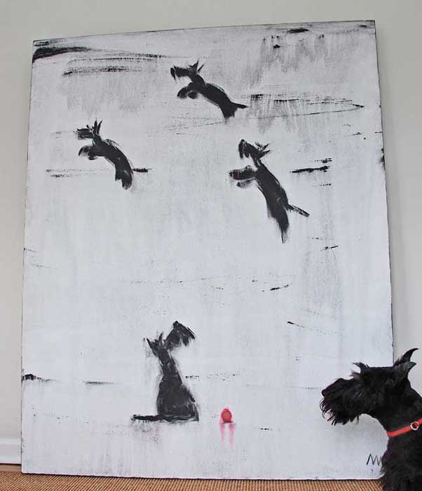
Hi, Critique Club here...
I think this is a great idea!
There are a few things that I think might be improved on.
1) It lacks a bit of contrast, maybe from compression.
2) There is parallax distortion because you weren't centered when you took the photo.
3) Would have been nice to crop it tighter to eliminate the walls and such.
4) I think the dog is cropped too tight. I would have liked to have seen more of him, ideally facing the picture so it looks like he is really looking at it. I realize that what we want and what the dog wants are usually different though ;) I think the red collar is distracting and the picture would have been better without it.
I would definately like to see you work this concept a bit more.
These are just one person's opinions so take it as that. |
|
 Photographer found comment helpful. Photographer found comment helpful. |
Comments Made During the Challenge  |
|
|
03/07/2010 05:30:09 PM |
| Cute :-) Think I might have tried to get him so that all that was in the show was the Scottie and the artwork as background. Or at least kept the floor out of it. |
|
| Photographer found comment helpful. |
|
|
03/05/2010 09:51:00 PM |
|
| Photographer found comment helpful. |
|
|
03/05/2010 04:44:54 PM |
| this is such a cute picture...well done |
|
| Photographer found comment helpful. |
|
|
03/05/2010 01:12:26 PM |
| Very odd. I kinda like it. Watch the compression, though. At a 54k file size, you used a lot of JPEG compression and it is taking away much clarity from the image. Compression kills detail. Always use the least compression you can and still fit into the challenge limit. |
|
| Photographer found comment helpful. |
|
|
03/04/2010 03:44:25 PM |
|
| Photographer found comment helpful. |
|
|
03/02/2010 07:19:19 AM |
I'm going through the entries, stopping at those images I feel have had the benefit of an unconventional eye and dwelling a little longer to try to see and appreciate what you saw. This is one of those images.
Positives: What a quirky image! There is loads of potential in this scene, a great set up!
Negative stuff: What a shame! I think with a good edit this would be very nice indeed but at the moment it just cries out for some (software) attention.
Overall: A disappointing image but not because of the photography but the way that it says 'sub-optimal' so very loudly. Perhaps you don't have access to the necessary software or simply prefer a 'straight-out-the-camera' look but for me this is almost criminally under-edited.
I'm revisiting this - all of the above sounds quite harsh now I read it back. I do want to emphasise that I really, really like the idea behind the shot. |
|
| Photographer found comment helpful. |
|
|
03/01/2010 08:57:02 PM |
| Neat shot. He appears to be studying. |
|
| Photographer found comment helpful. |
|
|
03/01/2010 12:46:49 PM |
| oh my goodness. This is just too wonderful.. |
|
| Photographer found comment helpful. |
|
|
03/01/2010 08:48:20 AM |
| How cute!!!! I hope the rule about displayed art doesn't hurt this image. I love the painting. |
|
Home -
Challenges -
Community -
League -
Photos -
Cameras -
Lenses -
Learn -
Help -
Terms of Use -
Privacy -
Top ^
DPChallenge, and website content and design, Copyright © 2001-2025 Challenging Technologies, LLC.
All digital photo copyrights belong to the photographers and may not be used without permission.
Current Server Time: 03/11/2025 02:11:27 PM EDT.