| Author | Thread |
Comments Made During the Challenge  |
|
|
11/23/2002 10:59:00 PM |
| Clever play on words and good image. Nice job! Grayce |
|
|
|
11/23/2002 01:50:00 PM |
| this is really great! I hope this wins. |
|
|
|
11/23/2002 12:06:00 AM |
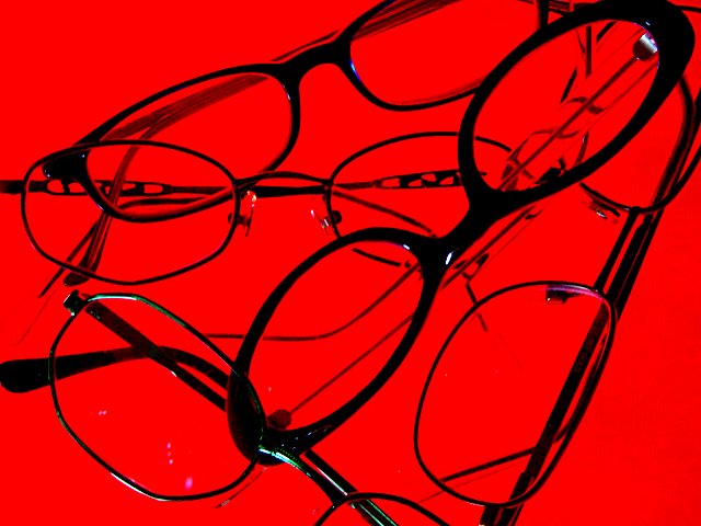
| Great vibrant colour and good design andrewm |
|
|
|
11/22/2002 06:26:00 AM |
| I like it. Nice bright red colour. jacko. 7 |
|
|
|
11/21/2002 09:34:00 PM |
| the image needs to be smoother, as gamers jargon goes " jaggies" .... the glasses have very jagged edge. I dont know what kind of camra you have, perhaps you have over sharpend? or blown up the image too big? |
|
|
|
11/21/2002 09:41:00 AM |
| Very "eye-catching" background here. I like the starkness of the frames against the red, but its too bad the purple pixels in the lower left corner are present. |
|
|
|
11/20/2002 05:32:00 PM |
| I'm sorry but I just do not personally these "RED" pictures at all. They do nothing for me and are very detracting to your subject. I know a lot of people use this technic but personally turns me off big time. Sorry. PTL |
|
|
|
11/20/2002 06:51:00 AM |
| Interesting image. Pity about the reflections in the lens at the bottom, left. Composition isn't to my liking, but that's just a personal preference. |
|
|
|
11/20/2002 02:49:00 AM |
|
|
|
11/20/2002 12:58:00 AM |
| Intresting. But where were you leading the person looking into the picture. |
|
|
|
11/19/2002 06:39:00 PM |
| Very interesting photo. Personally I would have chosen a different color for the background, but it's still a good idea. |
|
|
|
11/19/2002 06:29:00 AM |
|
|
|
11/19/2002 12:29:00 AM |
| The red bacground is a bit overpowering and the pink spots on the lens in the lower left hand corner distracting. Clever idea and interesting layout 6 Sulamk |
|
|
|
11/18/2002 11:57:00 PM |
too bad ya can't edit out the purplish spots on the one pair of glasses.... that would help... otherwise great shot
~anachronite |
|
|
|
11/18/2002 09:48:00 PM |
|
|
|
11/18/2002 07:06:00 PM |
| Maybe a different background would of helped here. I think your idea is very creative. Justine. |
|
|
|
11/18/2002 06:15:00 PM |
| Too much red. It overwelms the glasses. |
|
|
|
11/18/2002 12:46:00 PM |
| Nice shot, and a great idea. I think the vibrant background color is a little distracting. |
|
|
|
11/18/2002 07:56:00 AM |
| the red is too distracting. The glasses could be arranged a little better too. looks like you did a bit too much sharpening |
|
Home -
Challenges -
Community -
League -
Photos -
Cameras -
Lenses -
Learn -
Help -
Terms of Use -
Privacy -
Top ^
DPChallenge, and website content and design, Copyright © 2001-2025 Challenging Technologies, LLC.
All digital photo copyrights belong to the photographers and may not be used without permission.
Current Server Time: 03/12/2025 01:15:52 AM EDT.