Critique Club Critique
First Impressions
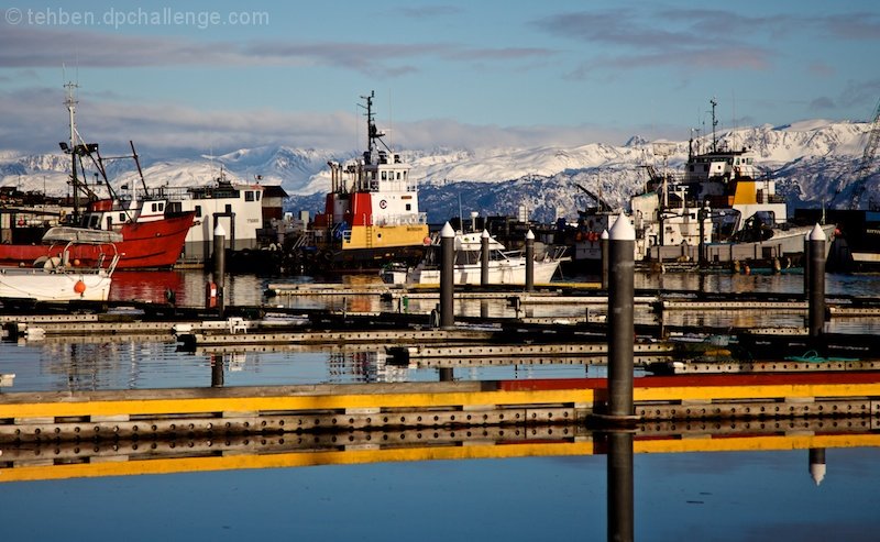
Good clarity and quality in the image, nice capture of a semi-remote (?) harbor scene. I gave this a 5 during voting.
Photograph Information, Technicals & Composition Review
Overall, there is too much contending for attention in the image. There is the foreground(which does dominate the image, and is also slightly OOF), the boats and harbor, the water, the colors (of course) and the distant mountains. It is hard to find a balance, compositionally, let alone with the colors - and also contrasting scenes, which, while not a 'bad' in my opinion, do not work well in this image, for me.
The depth from the middle part of the image to the outer is good, but as mentioned above, the OOF (out of focus) foreground dominates too much and 'unsettles the eye' for the remaining travels around and within the image.
If you wanted to highlight your observation (seemingly, by your title), I would suggest a much bolder crop, focussing in and composing to enhance the selected color(s).
Comments, Score & Placement Review
304/378 is getting down the bottom end of the pack but your score remained over 5 (5.19) which is usually indicative of an 'acceptable' photograph, in the eyes of the voters (although I'm not speaking for them of course).
6.33 average from your 3 commenters, all of which tell you what they like about your image and one giving some good suggestion on a potential improvement, which I tend to agree with for the most part (about the sharpness).
Summary
As mentioned above, a variation in cropping or else more of a 'scene' and a different title (to ensure you do not confuse the viewer).
PS
I see you have recently joined DPC and that this was your first submission - Congratulations and welcome to DPC.
|