| Author | Thread |
Comments Made During the Challenge  |
|
|
03/05/2010 09:06:35 PM |
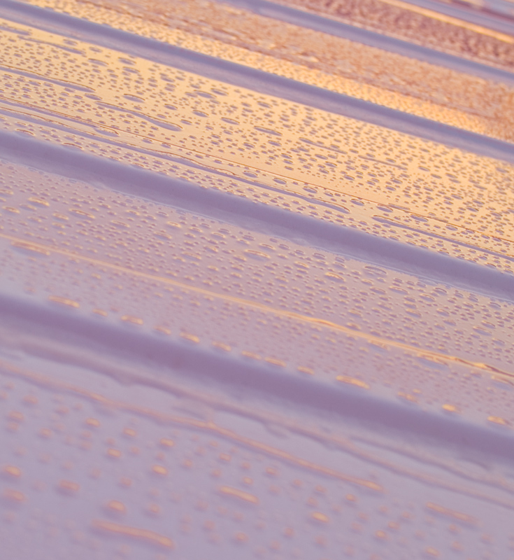
| Good gradient with complimentary colors... the blue to the orange is good. It is somewhat high key but I think it comes from the muted pastel colors. I think I would like to see a smaller aperture (f11-f22) to compare because more than two thirds of the shot is OOF due to the depth of field created. |
|
|
|
03/03/2010 04:12:32 PM |
| i like the photo, love the dof |
|
 Photographer found comment helpful. Photographer found comment helpful. |
|
|
03/03/2010 02:10:22 PM |
| I like the soft feel of this photo. Wonderful lines |
|
| Photographer found comment helpful. |
|
|
03/03/2010 07:21:15 AM |
| excellent abstract interpretation! Well done! |
|
| Photographer found comment helpful. |
Home -
Challenges -
Community -
League -
Photos -
Cameras -
Lenses -
Learn -
Help -
Terms of Use -
Privacy -
Top ^
DPChallenge, and website content and design, Copyright © 2001-2025 Challenging Technologies, LLC.
All digital photo copyrights belong to the photographers and may not be used without permission.
Current Server Time: 04/01/2025 09:23:37 PM EDT.