| Author | Thread |
Comments Made During the Challenge  |
|
|
07/04/2004 10:16:30 PM |
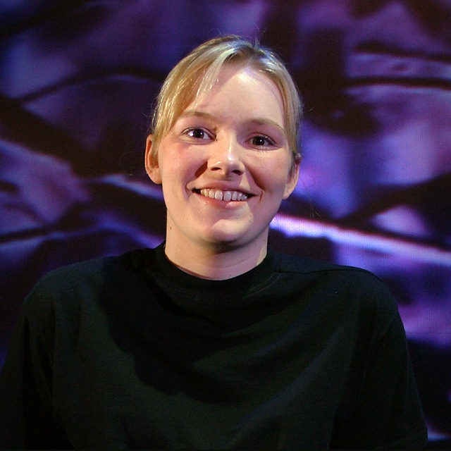
Lighting: Good, with expressive catchlights, but would have been better with a reflector bouncing the light back up from below to soften the shadows.
Pose: she just jumps right out and says 'hi' doesn't she. I would have place her face more toward the upper-left third and not cut off her arm.
Background: very busy, with not enough separation between the black shirt and the dark spots in the background. |
|
|
|
07/02/2004 11:10:48 PM |
| Strong colors, lighting make me think of a concert photo. I think as a "portrait" it would be stronger with a somewhat tighter crop. |
|
 Photographer found comment helpful. Photographer found comment helpful. |
|
|
07/02/2004 06:26:50 PM |
| That bright white stripe on the background really distracts from her. Pose and clothing choices work well. |
|
| Photographer found comment helpful. |
|
|
07/02/2004 12:01:03 PM |
| Lighting appears to be a bit harsh, resulting in shadows on her face, neck, and chest. The BG is also a bit distracting. Good pose and focus, would like a bit of an off-centered approach but that's just me. This has a lot of potential with some minor lighting adjustments IMHO. :o) |
|
| Photographer found comment helpful. |
|
|
07/01/2004 01:37:45 PM |
| Distracting background, a closer crop would probably work better. |
|
| Photographer found comment helpful. |
|
|
07/01/2004 09:13:50 AM |
| really needs some more light to balance out your main source - the shadows on the cheek and eye sockets and under the hair could do with some balancing |
|
| Photographer found comment helpful. |
|
|
06/30/2004 11:10:44 PM |
| I don't really like how the shirt fades into the background. I think it could be cropped closer. Lighting is good. Background is interesting, but I notice miniture pixalation in it. Is it a TV or a projecter?. Neat image or slight selective blurring whould have cleaned that up. Expression is good, got the sparkle in the eyes. |
|
| Photographer found comment helpful. |
|
|
06/30/2004 05:59:56 PM |
| Nice expresion pleasant smile I think the lighting is good |
|
| Photographer found comment helpful. |
|
|
06/30/2004 05:27:59 PM |
| Light is a little harsh on top. |
|
| Photographer found comment helpful. |
|
|
06/30/2004 02:49:43 PM |
| Better lighting would improve this a lot. The shadows on her face are really distracting. Lovely girl, though. |
|
| Photographer found comment helpful. |
|
|
06/30/2004 02:22:45 PM |
| nice photo, but the lighting on the face seems harsh to me |
|
| Photographer found comment helpful. |
|
|
06/30/2004 01:12:28 PM |
| the shadows on the face and the bright spot on the forehead are negatives, background adds interest, but the eyes and that smile are big positives |
|
| Photographer found comment helpful. |
|
|
06/30/2004 12:37:16 PM |
Good creative use of lighting. You do have some purplish cast in the shadows of her face though. Not sure what caused this. A white poster board reflector on that side would help with this I believe. I love that you managed to get the catch light in her eyes. Very important in a portrait. My biggest complaint with this shot though is that her outfit and the background kind of blend together. THis makes her look like a floating head which is not as pleasant an image as she deserves.
TC |
|
| Photographer found comment helpful. |
|
|
06/30/2004 09:22:30 AM |
| The lighting isn't quite right here. There's a few shadows on her face that are noticeable which kind of makes one eye dark, and one eye light. Very natural expression though. |
|
| Photographer found comment helpful. |
|
|
06/30/2004 04:19:42 AM |
| Lovely portrait, great model, and the background is excellent. |
|
| Photographer found comment helpful. |
|
|
06/30/2004 02:23:11 AM |
| Hi Kelly. You have a nice looking, but very centered image here. It's well done but the background detracts from your lovely face. |
|
| Photographer found comment helpful. |
|
|
06/29/2004 10:25:57 PM |
| IMO the lighting in this portrait creates too many unflattering shadows on your model's face. |
|
| Photographer found comment helpful. |
|
|
06/29/2004 09:38:00 PM |
| Your model is beautiful and I love the background. It is very original. I would like to see a different pose, though. Maybe turn the shoulders a quarter turn. The pose seems to be too straight on. |
|
| Photographer found comment helpful. |
|
|
06/29/2004 01:21:56 PM |
| try raising the camera angle and turning her shoulders so that they are not square with the camera |
|
| Photographer found comment helpful. |
|
|
06/29/2004 12:51:54 PM |
| Would have worked better with more Direct lighting -- not so many shadows on her face... |
|
| Photographer found comment helpful. |
|
|
06/29/2004 05:26:16 AM |
| Nice but I think if she wore a shirt that complimented the background instead of trying to blend in it. |
|
| Photographer found comment helpful. |
|
|
06/28/2004 11:52:15 PM |
|
| Photographer found comment helpful. |
|
|
06/28/2004 07:01:38 PM |
| The harsh shadows detract from a beautiful model |
|
| Photographer found comment helpful. |
|
|
06/28/2004 06:06:17 PM |
| Lighting could have been better. You have a lot of shadows in the face that makes this picture hard (frontal flash?) But not all bad (6) |
|
| Photographer found comment helpful. |
|
|
06/28/2004 03:05:17 PM |
| Very shiny, creased background overwhelms the model. She has a nice expression but the shadows in the lower portion of her face (under the apples of her cheeks and under her chin) are very unflattering. |
|
| Photographer found comment helpful. |
|
|
06/28/2004 02:42:26 PM |
| Good shot. I like the colors, but a reflector in front of the subject would help with the shadows on her face and neck. |
|
| Photographer found comment helpful. |
|
|
06/28/2004 02:05:24 PM |
| the background is very distracting, maybe if you blurred it a bit more it would be better. Her forehead is a bit too light. Natural smile though |
|
| Photographer found comment helpful. |
|
|
06/28/2004 12:12:08 PM |
| Her body is lost in the background, maybe a different top. |
|
| Photographer found comment helpful. |
|
|
06/28/2004 10:19:48 AM |
| The background is to distraction ... looks blury and takes my eyes from the subject. try also not to have thesubject in the midle ... more to the left or right would be better |
|
| Photographer found comment helpful. |
|
|
06/28/2004 02:38:37 AM |
Something really nice about this shot.
You have captured a natural beauty in a studio situation and managed to make her look so relaxed.
Good luck
9 |
|
| Photographer found comment helpful. |
|
|
06/28/2004 12:28:14 AM |
| the light is rather glaring |
|
| Photographer found comment helpful. |
Home -
Challenges -
Community -
League -
Photos -
Cameras -
Lenses -
Learn -
Help -
Terms of Use -
Privacy -
Top ^
DPChallenge, and website content and design, Copyright © 2001-2025 Challenging Technologies, LLC.
All digital photo copyrights belong to the photographers and may not be used without permission.
Current Server Time: 03/12/2025 11:43:19 AM EDT.