| Author | Thread |
|
|
03/18/2010 07:45:28 PM |
| I thought this would score higher! I was your 10. :) |
|
 Photographer found comment helpful. Photographer found comment helpful. |
|
|
03/15/2010 09:38:17 AM |
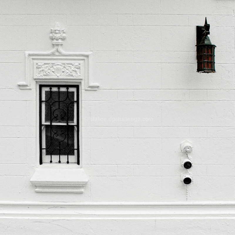
| I like how the three objects connect to make a triangle. :) |
|
| Photographer found comment helpful. |
|
|
03/15/2010 09:36:42 AM |
| An interesting image. I liked the comp, it draws you in, nice find and work. |
|
| Photographer found comment helpful. |
|
|
03/15/2010 12:21:37 AM |
Oh, so this was yours. I wrote a very long essay about this in my head about all that this conjured, but I'm afraid it turned political.
Beautifully composed, cunningly even deceitfully(?) simple. |
|
| Photographer found comment helpful. |
Comments Made During the Challenge  |
|
|
03/14/2010 11:38:19 PM |
| I wish to comment sometime. |
|
| Photographer found comment helpful. |
|
|
03/14/2010 10:38:06 PM |
|
| Photographer found comment helpful. |
|
|
03/14/2010 02:52:34 PM |
| 5 - The composition and crop are sound enough, but there is something missing for me, maybe texture... who knows. |
|
| Photographer found comment helpful. |
|
|
03/14/2010 12:32:16 AM |
A little bit of pincushion barrel distortion here, but I like the composition. It's artistic and nicely balanced.
Message edited by author 2010-03-15 18:05:17. |
|
| Photographer found comment helpful. |
|
|
03/13/2010 03:44:22 PM |
| Revisiting entry and reviewing score: up with 2 points. |
|
| Photographer found comment helpful. |
|
|
03/12/2010 07:04:18 PM |
| Black and White, but not desaturated... Hmmm... Think I saw someone mention this in the forums so I think I know who you are... Anyway, its a pretty interesting shot with allot of subtle things going on. I like the shapes that the lines form... 6 |
|
| Photographer found comment helpful. |
|
|
03/12/2010 04:34:15 PM |
|
| Photographer found comment helpful. |
|
|
03/12/2010 01:56:43 AM |
| The visible elements create a tension as to the context of the building. |
|
| Photographer found comment helpful. |
|
|
03/11/2010 02:38:43 PM |
| Love the simpleness of this. |
|
| Photographer found comment helpful. |
|
|
03/11/2010 03:44:14 AM |
|
| Photographer found comment helpful. |
|
|
03/10/2010 07:54:35 AM |
| This one made me think - should the lantern on the uppper right be black and white or color???? Guess that's what "modern" art does - makes you think hmmmm. |
|
| Photographer found comment helpful. |
|
|
03/09/2010 06:00:04 PM |
| I really like this. Almost looks like it could be a stage presentation. |
|
| Photographer found comment helpful. |
|
|
03/09/2010 01:25:47 PM |
| This blends very well here, a top pick for creativity.. |
|
| Photographer found comment helpful. |
|
|
03/09/2010 11:10:31 AM |
| very, clean, simple and yet elegant...wonderful balance |
|
| Photographer found comment helpful. |
Home -
Challenges -
Community -
League -
Photos -
Cameras -
Lenses -
Learn -
Help -
Terms of Use -
Privacy -
Top ^
DPChallenge, and website content and design, Copyright © 2001-2025 Challenging Technologies, LLC.
All digital photo copyrights belong to the photographers and may not be used without permission.
Current Server Time: 03/10/2025 07:07:08 PM EDT.