| Author | Thread |
Comments Made During the Challenge  |
|
|
03/16/2010 07:38:00 PM |
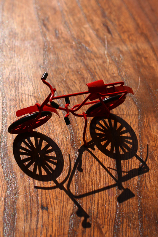
I wish the top part had been cropped off to make the composition more centered. The top is boring to me. Just sayin'... :)
Still it's a good image that I really like. |
|
|
|
03/15/2010 09:47:12 PM |
Cute and nostalgic! I'm liking the DOF as well as it brings interest to your composition.
I think I would like it better if the bike was located on a different surface and if the shadow was right side up (if that makes sense!) :) |
|
|
|
03/14/2010 05:54:55 AM |
| This would have worked in the toy challenge as well |
|
|
|
03/11/2010 11:13:01 PM |
I think has potential but for me I found the loss of focus in the table at the top a little off-putting and the position of the red bike in the middle of the photo kind of boring - wondering if cropping it so bike was in top half (remove the blurred part of table)would make it more interesting.
Then again that is just me! |
|
|
|
03/11/2010 04:58:51 PM |
| Very sweet. Perhaps too much negative space on top. |
|
|
|
03/10/2010 12:58:23 AM |
| weird background... to me it doesn't fit the subject. i do like this toy bike though! |
|
Home -
Challenges -
Community -
League -
Photos -
Cameras -
Lenses -
Learn -
Help -
Terms of Use -
Privacy -
Top ^
DPChallenge, and website content and design, Copyright © 2001-2025 Challenging Technologies, LLC.
All digital photo copyrights belong to the photographers and may not be used without permission.
Current Server Time: 04/25/2025 09:44:15 AM EDT.