| Author | Thread |
|
|
04/21/2010 12:42:47 AM |
| Another cool shot. Surprised at the score. Would have thought higher.... |
|
 Photographer found comment helpful. Photographer found comment helpful. |
|
|
04/08/2010 08:46:35 PM |
Originally posted by bvy:
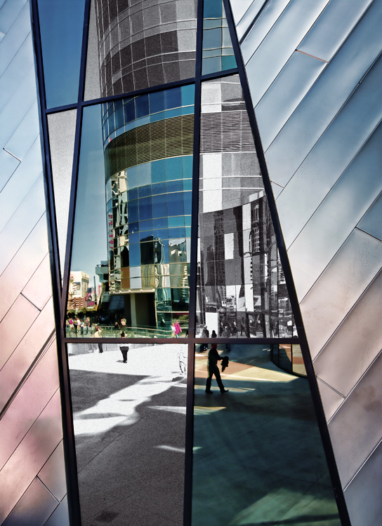
A fantastic composition ruined by selective desat. |
I meant to revise my comment before the challenge ended -- it was a bit harsh. I do love the composition, and I think the lines and shapes and fragmented nature of the composition were enough to hold the viewer's interest. I've seen worse applications of selective desat, but I think this would have held up nicely as a straight black and white, or with a very subtle, but uniform color scheme. |
|
| Photographer found comment helpful. |
Comments Made During the Challenge  |
|
|
04/07/2010 12:03:19 AM |
| So often these reflection-in-a-building-shots are just kind of "blah." This is very well done. It is well composed. The lines are awesome. The post processing is artfully done without being over-done. Nice job, here. |
|
| Photographer found comment helpful. |
|
|
04/05/2010 09:10:42 AM |
| This is a fun abstract type of image. I might have taken a smidge off the bottom for better balance. JMO. Good luck. |
|
| Photographer found comment helpful. |
|
|
04/03/2010 09:12:07 PM |
| A fantastic composition ruined by selective desat. |
|
|
|
04/02/2010 06:25:59 AM |
I'm going through the entries, stopping at those images I feel have had the benefit of an unconventional eye and dwelling a little longer to try to see and appreciate what you saw. This is one of those images.
Positives: I really like this - The metallic colour palette is really nice, particularly the side sections. The architecture, the geometry, the reflected scene all add interest - I think the selective desaturation works too - it serves to emphasise the most interesting (colour) sections of you image.
Critical stuff: Nothing at all.
Overall: A very successful image - I like that we can see ample evidence of photographic choices you made. |
|
| Photographer found comment helpful. |
|
|
04/01/2010 05:17:54 AM |
| Interesting idea & Im not sure its worked for me, the cladding beside the window is great, love the colours, the tilt on the building in the reflection I think is what puts me off. |
|
| Photographer found comment helpful. |
Home -
Challenges -
Community -
League -
Photos -
Cameras -
Lenses -
Learn -
Help -
Terms of Use -
Privacy -
Top ^
DPChallenge, and website content and design, Copyright © 2001-2025 Challenging Technologies, LLC.
All digital photo copyrights belong to the photographers and may not be used without permission.
Current Server Time: 03/16/2025 07:38:32 AM EDT.