| Author | Thread |
|
|
08/19/2004 06:26:41 PM |
| This is such a nice shot! I love lighthouses too and I have quite a few shots of them. If I join, I'll post some. You deserved a MUCH better standing with this shot - top 10 at least! Such a peaceful and relaxing photo to look at! Thanks for sharing this beautiful creation! |
|
 Photographer found comment helpful. Photographer found comment helpful. |
|
|
07/09/2004 09:17:25 PM |
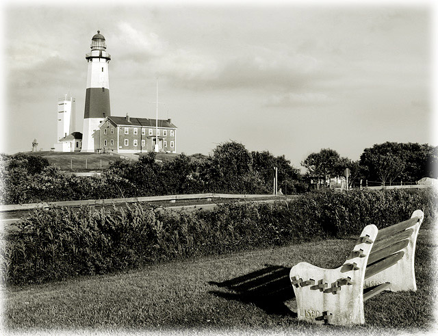
HI. I was one of the givers of 5.
What I noticed about this is that the lights are too light. There seems to be a section on the value scale that is missing. Mostly in the mid to light grays. To me that made the picture seem both flat and harsh. I didn't mind the bench being so removed from the light house but the area between the two seems unattractive especially the section with the sign and whatever the wooden outline is. As for the border, I think the majority of voters on this site might knock off a point for it.
You have some fantastic lighthouse pictures that I'm sure anyone would be proud to have hanging on their walls. |
|
| Photographer found comment helpful. |
|
|
07/09/2004 08:27:18 PM |
| What I liked quite a bit about this shot (and I did look at a few times) is the shadow in front of the bench. That is actually what raised it from a 5 to a 6 for me after looking at it for about the third time. I really liked the bit of graphic and tonal contrast it added. Which leads me to think that what may have been lacking for me in was a bit more dynamics in tone. I like the scene and it should appear somewhat serene but perhaps it is a bit too restful. I wonder if perhaps a bit of dodging and burning to add some drama to the sky might improve things. I can already see a section of sky that could be darkened a tad by judiciously burning some middle values and brightening the highlights at the edges of the clouds. This would add depth and drama to the sky which now appears rather flat. |
|
| Photographer found comment helpful. |
|
|
07/09/2004 07:06:41 PM |
Hi Nancy,
I one of the guilty folks who gave you a 5 on "The View of Decades." I do not dislike lighthouses - as a matter of fact - I have quite a few in my collection as well. I'm sure not as many as you - you have a fantastic and elegant collection.
So - why a 5?
a) The biggest reason for me is the composition. The bench and the lighthouse seem like two different images. The bench, instead of being a lead-in has become a competitor for attention. Perhaps a slight different angle, placing the lighthouse and the bench in closer visual arrangement would help.
b) The second reason, almost as important as the composition to me, is that I am a huge fan of black and white. But I am also very "picky" about it. This image does not meet my requirement that there should be at least "some" very white whites as well as some black blacks - and there should be a good tonal range as well. I just don't see the white whites I expect in a great B&W image.
c) The lighthouse appears slighty crooked.
d) Although I do like some versions of lightened edges to form a border - I don't think this one works very well.
e) Finally, the sky is rather bland for me. I would love to see some puffy cumulus clouds pop out of a nice blue sky. There are clouds in your image but they are not tonally much different than their surroundings.
Another thing you should consider is the VAST amount of really powerful images in this challenge. I gave more high scores for this than any I remember. Some voters may judge "on the curve" so that scores for less than "really wow" images would tend to be lower.
I hope you find these blunt and honest opinions a help - so you can at least understand my reasoning. If you have questions or comments, feel free to e-mail me. (PM does not work for me for some unknown reason.)
Message edited by author 2004-07-09 21:18:49. |
|
| Photographer found comment helpful. |
Comments Made During the Challenge  |
|
|
07/06/2004 08:01:18 PM |
| the tone is really nice. The border even work well here. good job |
|
| Photographer found comment helpful. |
|
|
07/06/2004 07:11:53 PM |
| very cool shot. I think it would have looked better in colour tho. Just my opinion. Good luck! |
|
| Photographer found comment helpful. |
|
|
07/01/2004 09:31:11 PM |
| You've very effectively established a certain tone with this shot. |
|
| Photographer found comment helpful. |
|
|
07/01/2004 07:02:00 PM |
| Nice composition. Black & White is very effective for this shot |
|
| Photographer found comment helpful. |
|
|
07/01/2004 05:11:01 PM |
| postcard perfect to me....I like lighthouses too....nice photo |
|
| Photographer found comment helpful. |
Home -
Challenges -
Community -
League -
Photos -
Cameras -
Lenses -
Learn -
Help -
Terms of Use -
Privacy -
Top ^
DPChallenge, and website content and design, Copyright © 2001-2025 Challenging Technologies, LLC.
All digital photo copyrights belong to the photographers and may not be used without permission.
Current Server Time: 04/01/2025 09:11:49 PM EDT.