| Author | Thread |
Comments Made During the Challenge  |
|
|
11/23/2002 08:50:00 PM |
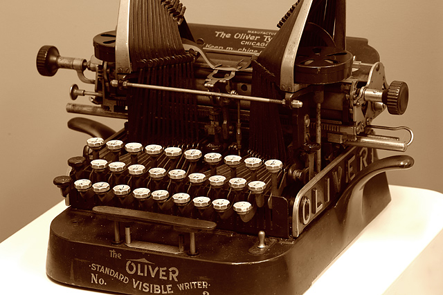
| wonderful composition and use of sepia...very sharp. |
|
|
|
11/22/2002 11:21:00 PM |
| Great subject, color and lighting. I do however, think that better framing/cropping, would make this much better. |
|
|
|
11/22/2002 10:25:00 PM |
They say great minds think alike...mine is the close up of the keys. I won't divulge my name though, so my picture will remain anonymous......for now. :-)
You did a nice job! Good luck. |
|
|
|
11/22/2002 06:51:00 AM |
| very crisp and alive. i'm a sucker for antique typewriters and manual calculators. |
|
|
|
11/21/2002 10:22:00 PM |
| Wish it wasn't cropped so tightly. I would have liked to see the whole thing. Very nice shot, though. |
|
|
|
11/21/2002 10:02:00 AM |
| Lovely. I would have chosen a slightly more interesting angle though. 8 |
|
|
|
11/21/2002 09:43:00 AM |
| Wonderful picture. Good focus. Black and White moves this typewriter. |
|
|
|
11/20/2002 07:08:00 PM |
| Wish you hadn't cut the top and bottom off. Good exposure, nice and sharp. Otherwise a very good picture. 7 |
|
|
|
11/20/2002 08:01:00 AM |
| This is a very interesting object and the picture has charm. But I wonder whether a full-on, 'portrait'-oriented version of it would provide a more satisfying chunk of three-dimensional space required for a balanced photograph. Just a thought. Very good though. |
|
|
|
11/19/2002 10:35:00 PM |
| What I really like about the photo is the sepia tone that conveys the typewriter's antiquity, and the lighting (except perhaps the really dark shadows in certain spots). I think though, that it has lost something compositionally by being shot straight on instead of trying out other viewpoints. Perhaps getting in closer and making it slightly more abstract? |
|
|
|
11/19/2002 08:45:00 PM |
|
|
|
11/19/2002 01:52:00 AM |
| Why in the world di you crop off part of this beautiful machine? Why? I don't care what anyone else says you should not have done it! That's my personal opinion. That lost my 10. PTL Thought about it and the crop on corpped off 1 point. |
|
|
|
11/18/2002 11:39:00 PM |
| I love this !!!! I wish you had not took the bottom right corner off Shiiizzzam |
|
|
|
11/18/2002 08:30:00 AM |
| Works well in cepia and good focus. I didn't really like the framing of the object though. |
|
|
|
11/18/2002 03:45:00 AM |
| A technically good photo but no wow appeal 7 sulamk |
|
|
|
11/18/2002 01:19:00 AM |
| Nice photo, well exposed and the sepia works well. What really lets this down is the cropping - cutting off the top and especially the bottom just throws the whole composition right off - The subject 'appears' to have more height than width so might have worked better in portrait with some negative space at the top: 6 -lamedos- |
|
Home -
Challenges -
Community -
League -
Photos -
Cameras -
Lenses -
Learn -
Help -
Terms of Use -
Privacy -
Top ^
DPChallenge, and website content and design, Copyright © 2001-2025 Challenging Technologies, LLC.
All digital photo copyrights belong to the photographers and may not be used without permission.
Current Server Time: 03/12/2025 01:33:26 AM EDT.