| Author | Thread |
|
|
07/08/2004 03:43:56 AM |
Thanks for your comments, Tom. I actually replied to your comments in the "burnout thread" when I should have done so here. But I do agree with your issues and I need to get more Photoshop skills under my belt before I can take further advantage of its features.
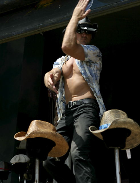
There is only one point I'd like to provide a counterpoint and that's issue E. I presume you are talking about the one with the blue trim? If so, I purposefully blurred those hats in the front to increase focus on the model/dancer yet show that his purpose is to sell hats.
Thanks again, Tom! |
|
|
|
07/07/2004 02:25:16 AM |
Hi Greg - This post is the result of your request for an in depth critique.
I am a member of the critique club but was NOT assigned this image.
I do have an AA degree in photography and judge photo competitions outside of DPC regularly.
I gave this image a 4 during the extraordinary challenge - which just happens to be the "most popular" score. For me the idea was great but the image itself is very diffuicult to read.
Since you asked for specific points to consider:
a) Lighting: the area of most contrast is on the man's chest and right shoulder - making the eye go there. But when you get there - there's nothing, so you need to explore more. It's better if the highest contrast area is where you want the viewer to "land." It is also very uncomforable for some if the face is difficult to see as this one is.
b) Pose: Both arms and hands are in unusual positions. The right arm is difficult to read as it is shot nearlt "head on." The left ARM looks like it may be in a position of giving you the finger - but of course it's not. The left fingers are chopped off - not a good compositioanl technique.
c) The window frame behind the man's head is a bit detracting.
d) I just asked my wife (a very talented artist) to look at the image. She thought at first glance - that it was a woman's body - because the head was in shadow and the chest area just appeared "womanly."
e) The hat on the right is a bit soft.
I think the biggest "problem" is that you were there, you heard the music and the image brings back those memories. It's much like an ocean scene that when you take it you see the scene, but you also feel the wind on your face and smell the smells so unique to the area.
Film (digital or otherwise) just can not capture smells or sounds just yet.
Another thing we must DPCers must keep in mind is that voters often press the score button very quickly and don't take time to study and appreciate each image. So - the image must be a quick read for higher scores.
Finally, remember the challenge was "Extraordinary" - so many viewers were wanting to be really wowed by somthing exceptional.
But - do NOT let this bother you - we all have peaks and valleys (and I am certainly in the valley category at the moment myself.) Keep shooting, keep submitting, and most importantly - keep having FUN!
-Tom- |
|
 Photographer found comment helpful. Photographer found comment helpful. |
|
|
07/07/2004 01:23:29 AM |
| Thank you to those that voted and left comments. They are all appreciated very much. This guy's dance was probably the best part and what you see here is just a slice of the entertainment. I guess this explains the poor scores as this freeze frame of his routine is quite out of context for most people. I hope I get some insight from the critique club about this one because I could REALLY use it. :( |
|
Comments Made During the Challenge  |
|
|
07/06/2004 10:00:50 PM |
| This man is out of control! I'm sure he must have brought a lot of business to this the store. I know this challenge is basic editing but, I would have liked to seen his face in the same tonal range as the rest of his flesh tones. Good Luck! 8 |
|
| Photographer found comment helpful. |
|
|
07/04/2004 04:52:34 PM |
| I really like this - and dfeinitely think the guy's bod is "extraordinary" - but I almost wish there was more lighting on his face. Overall though, a very good image. - 9 |
|
| Photographer found comment helpful. |
|
|
07/01/2004 02:16:33 PM |
Too strange.
If the shot was pulled back a little bit more I could get a better idea of what was going on. The motion blur on the arms does not work much for me. Actually, the very first thng to catch the eye is the shadow on his chest and the bulging pecs making the first impression of a woman's breast almost exposed. The title works well. |
|
| Photographer found comment helpful. |
|
|
06/30/2004 09:46:21 AM |
dont think its that extraordinary, except for the bod :]
5 |
|
| Photographer found comment helpful. |
Home -
Challenges -
Community -
League -
Photos -
Cameras -
Lenses -
Learn -
Help -
Terms of Use -
Privacy -
Top ^
DPChallenge, and website content and design, Copyright © 2001-2025 Challenging Technologies, LLC.
All digital photo copyrights belong to the photographers and may not be used without permission.
Current Server Time: 03/13/2025 03:19:41 AM EDT.