| Author | Thread |
|
|
04/11/2010 10:26:21 PM |
CRITIQUE CLUB CRITIQUE
by karmat
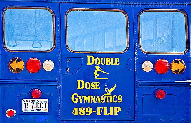
Compositionally, the image is a bit flat/static. It "fills the frame" but seems a bit too tight to have the eyes "roam" any. Also, it isn't quite straight one so it feels tilted even though the words seems straight.
Technically, the colors are really good. That bright blue is a great attention getter and the yellow provides a nice contrast. Also, the focus and exposure looks pretty good, except that resizing may have left some artifacts around the tag and lights.
Overall, a "cheerful" shot that definitely meets the challenge. It just lacks the "sophistication" that some of the pictures at the top had.
If you have any questions, let me know, and best wishes to you in future challenges!
karma |
|
 Photographer found comment helpful. Photographer found comment helpful. |
Comments Made During the Challenge  |
|
|
04/06/2010 11:46:21 PM |
| good idea...and brilliant colors too |
|
| Photographer found comment helpful. |
|
|
04/05/2010 04:41:22 PM |
|
| Photographer found comment helpful. |
|
|
04/03/2010 02:09:26 AM |
From the looks of those "rings" inside the bus, looks like they practice on the way to the competition.
Love the colors. (bump) |
|
| Photographer found comment helpful. |
|
|
03/31/2010 05:20:39 AM |
| Crikey! No lack of pop here. A little over-saturated in fact. Great subject choice... and perfect rule of thirds!! |
|
| Photographer found comment helpful. |
Home -
Challenges -
Community -
League -
Photos -
Cameras -
Lenses -
Learn -
Help -
Terms of Use -
Privacy -
Top ^
DPChallenge, and website content and design, Copyright © 2001-2025 Challenging Technologies, LLC.
All digital photo copyrights belong to the photographers and may not be used without permission.
Current Server Time: 04/26/2025 03:06:11 PM EDT.