| Author | Thread |
Comments Made During the Challenge  |
|
|
04/27/2010 04:58:37 PM |
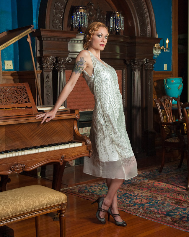
| Great picture, IMHO the only distraction are some small harsh shadows near the vase and from the piano lid. Great colors. Great model. Beautiful. |
|
|
|
04/27/2010 02:39:51 AM |
| There might just be too much going on in this shot, which is gorgeous. Love her face, her make-up, her hair, her shoes. Leaning against the piano might have been enough, with the rest just hinted at in the dark. |
|
|
|
04/26/2010 02:16:51 PM |
| The Tat takes the rest away from the vintage shot other than that it was working for me |
|
|
|
04/25/2010 11:46:33 PM |
| Oh my goodness I love love love her shoes!! Good luck! |
|
|
|
04/24/2010 09:54:32 AM |
| Fantastic stuff - love the pose, the dress, the location, etc.... |
|
|
|
04/22/2010 10:40:15 PM |
| love the contrast between the era of the room and dress and her tattoo |
|
|
|
04/22/2010 10:12:50 PM |
This is my absolute favorite - totally unique concept. The tones fit the portrayed era. Although the model is dead center, and surrounded by a lot of stuff, it is the bright colors of the objects on the right side that keep the eyes moving around the image.
On a personal note - the only thing that is jarring to me is the large tattoo on the model's arm I mean, how many elegant (or low class)women had tats back in the 20's. |
|
|
|
04/21/2010 05:17:19 PM |
| Great composition and light! |
|
|
|
04/21/2010 03:33:53 PM |
| I see the classic feel you were going for, but I'm not fully convinced you totally pulled it off. Mainly, the tattoo on her arm and her makeup detract from the classic-ness. |
|
|
|
04/21/2010 02:26:54 PM |
| A good shot, but the sharpest focus seems to be on her right shoulder rather than her face and there is maybe a little too much focus on the surroundings- they compete with your model. |
|
|
|
04/21/2010 01:23:06 PM |
| i dont like the light fixtures in the back bordering her head. light is very nice |
|
|
|
04/21/2010 12:20:05 PM |
|
|
|
04/21/2010 10:48:22 AM |
| Eyes are way to intense. A bit of dear in the headlights. The face is a bit out of focus for me to and I really think this would have been better in sepia. 5 |
|
|
|
04/21/2010 08:31:13 AM |
| tHose are villian eyes. lol |
|
|
|
04/21/2010 12:49:05 AM |
| the model looks scared! I think I would have tried using a spot light to create more drama in the shot. |
|
|
|
04/21/2010 12:17:54 AM |
| i would have liked it better if the dress was shorter and there wasnt that crazy look in her eye... |
|
Home -
Challenges -
Community -
League -
Photos -
Cameras -
Lenses -
Learn -
Help -
Terms of Use -
Privacy -
Top ^
DPChallenge, and website content and design, Copyright © 2001-2025 Challenging Technologies, LLC.
All digital photo copyrights belong to the photographers and may not be used without permission.
Current Server Time: 03/12/2025 08:53:31 AM EDT.