| Author | Thread |
|
|
07/09/2004 12:19:02 PM |
I only voted for 30% and didn't get to this one. The lack of comments would indicate that it is a competent picture but didn't inspire people much.
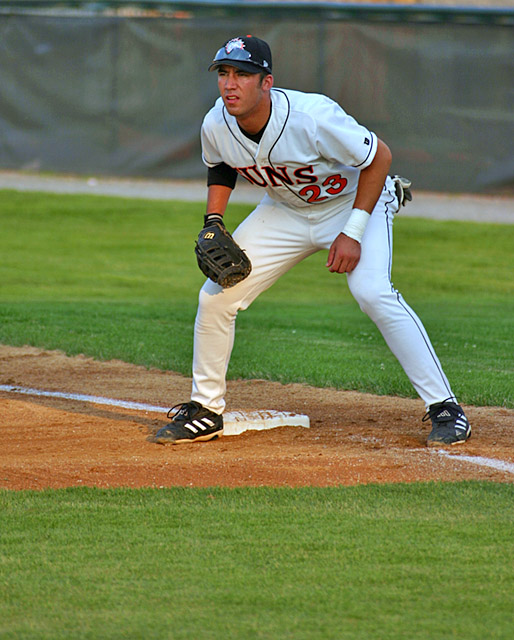
I think the colors are great as well as the exposure. Was this taken under mixed lights? If it was you did a good job balancing them out. His face is nicely illuminated. This would make a good publicity photo. |
|
 Photographer found comment helpful. Photographer found comment helpful. |
|
|
07/09/2004 12:12:42 PM |
| Bill -- I would have liked to see a little more of the bg.. maybe more around or above his head. I love the colours and the look of the subject, but I just feel like the crop is a bit tight. Because of his pose and the layout of a baseball diamond..even having him more to the right and more of the left part of the field might have added some more interest! |
|
| Photographer found comment helpful. |
Comments Made During the Challenge  |
|
|
07/02/2004 10:43:37 AM |
| For the cover of the Sports Illustrated? Like it, it has strong colors, and shows the true spirit of the game. |
|
| Photographer found comment helpful. |
Home -
Challenges -
Community -
League -
Photos -
Cameras -
Lenses -
Learn -
Help -
Terms of Use -
Privacy -
Top ^
DPChallenge, and website content and design, Copyright © 2001-2025 Challenging Technologies, LLC.
All digital photo copyrights belong to the photographers and may not be used without permission.
Current Server Time: 03/15/2025 03:01:37 AM EDT.