| Author | Thread |
Comments Made During the Challenge  |
|
|
04/30/2010 12:36:30 PM |
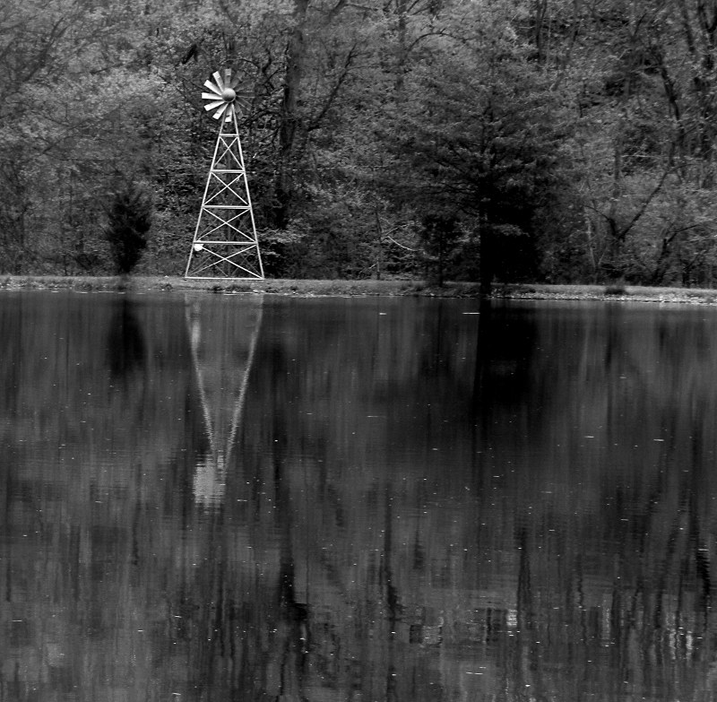
Lots of potential with this image and scene. It looks like the image isn't quite level. A simple thing to correct but if its not corrected its distracting.
The conversion looks like a straight gray scale conversion or desaturation. My recommendation would be to use the channel mixer (if its available) to to create a more dramatic monochrome.
Good call on leaving out the sky. I would consider cropping off a bit more off the bottom leaving the reflection of the tree and the windmill.
If there was sufficient wind to get the windmill going a long exposure would definitely be in order. It would flatten the water and create a nice motion blur in the mill.
It would be nice if there was a third element in the scene. With the windmill and tree being the subjects in the scene it feels a bit static. Of course you could just wade across and cut down the tree too... ;)
Overall a pleasing image and one that certainly meets the challenge. |
|
 Photographer found comment helpful. Photographer found comment helpful. |
|
|
04/29/2010 09:59:10 PM |
| I know you can't do anything about them but the bits in the water are really distracting my eye from the subject. Maybe a different angle or a different composition that didn't include as much of the water. My only other little nitpick is that it looks slightly crooked. |
|
|
|
04/29/2010 01:32:25 PM |
| I only wish the horizon was straight... |
|
|
|
04/28/2010 11:18:02 AM |
| I would have liked this shot more if you had rotated it slightly to make the shoreline horizontal. |
|
|
|
04/26/2010 11:57:19 PM |
| Like the square crop. The black is too much, not sure what's going on? |
|
|
|
04/26/2010 11:31:09 AM |
| It feels like the horizon is slightly off to me. |
|
|
|
04/26/2010 11:00:57 AM |
| You've got the rule of thirds going on here but, the bottom 2/3's is rather dull in the composition because it's lacking anything to look at. That means that 2/3's of the composition is of nothing of interest. I know that sounds harsh and I don't mean it to be, just giving a reason that it's not as striking a shot as it could be. |
|
| Photographer found comment helpful. |
Home -
Challenges -
Community -
League -
Photos -
Cameras -
Lenses -
Learn -
Help -
Terms of Use -
Privacy -
Top ^
DPChallenge, and website content and design, Copyright © 2001-2025 Challenging Technologies, LLC.
All digital photo copyrights belong to the photographers and may not be used without permission.
Current Server Time: 04/26/2025 01:53:26 PM EDT.