| Author | Thread |
|
|
05/03/2010 06:42:26 AM |
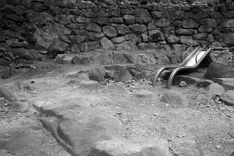
| Good tonal range, the position of the slide is excellent. Overall the wall does a good job of blocking the landscape which spoils the interest. |
|
 Photographer found comment helpful. Photographer found comment helpful. |
|
|
05/03/2010 12:46:54 AM |
| Now THAT is landscaping! Coolio. |
|
| Photographer found comment helpful. |
Comments Made During the Challenge  |
|
|
05/02/2010 08:29:36 PM |
| This slide looks so out of place in this setting. These look like an old foundation or something. Cool subject, but it doesn't feel like a landscape to me. |
|
|
|
05/02/2010 05:02:11 PM |
| Sorry, don't really see this as a landscape. |
|
|
|
04/30/2010 04:28:10 PM |
| What an interesting shot. I am making up all kinds of stories in my mind to suit it. You did a good job making the 'slide' stand out. I wonder if there were more pure blacks or higher contrast if it would pop even more? |
|
| Photographer found comment helpful. |
|
|
04/28/2010 11:19:36 PM |
|
|
|
04/26/2010 09:27:15 PM |
| a good black and white photo has in it true black and true white and grey tones.. This feels like a lot of grey tones. The possition of the slide on the right, sliding back into the image is good, had it been facing the other way it would has slid the veiwer right out of the picture. |
|
| Photographer found comment helpful. |
|
|
04/26/2010 08:48:02 PM |
| interesting choice of subject 6 |
|
| Photographer found comment helpful. |
|
|
04/26/2010 02:50:52 AM |
| ok,,, good one,,, but is the slide a little bit out of focus ??,,, |
|
| Photographer found comment helpful. |
Home -
Challenges -
Community -
League -
Photos -
Cameras -
Lenses -
Learn -
Help -
Terms of Use -
Privacy -
Top ^
DPChallenge, and website content and design, Copyright © 2001-2025 Challenging Technologies, LLC.
All digital photo copyrights belong to the photographers and may not be used without permission.
Current Server Time: 03/15/2025 06:45:09 PM EDT.