| Author | Thread |
|
|
05/05/2010 07:24:21 PM |
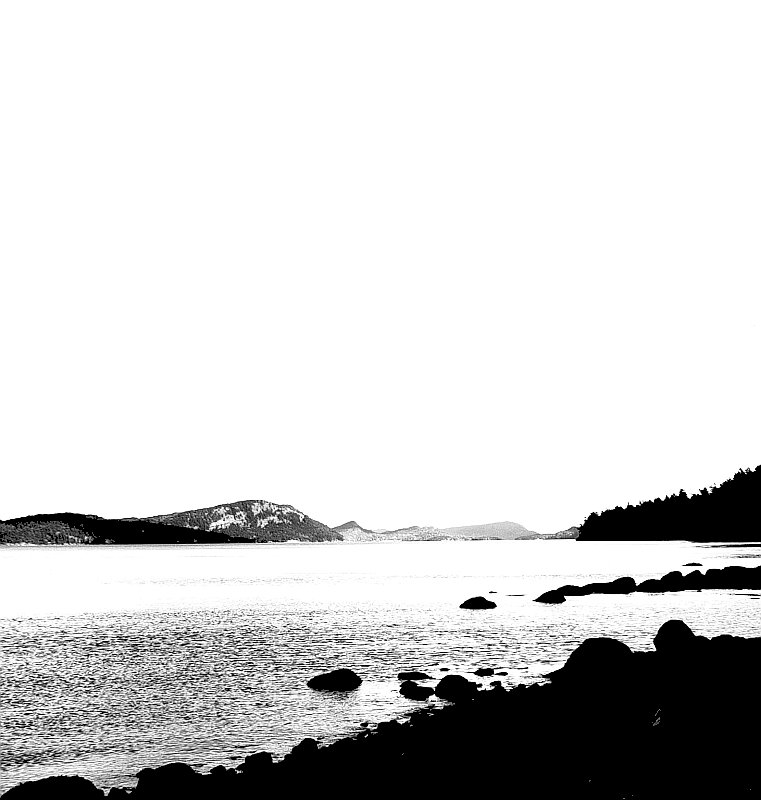
| I love this. I think the sky is perfect. |
|
 Photographer found comment helpful. Photographer found comment helpful. |
Comments Made During the Challenge  |
|
|
05/02/2010 08:50:28 PM |
| I like the negative space but the contrast is way too high imho. |
|
| Photographer found comment helpful. |
|
|
05/02/2010 04:47:14 PM |
| At first I really didn't like the extremely black areas, but I decided it's very interesting because of the really white areas and the composition. |
|
| Photographer found comment helpful. |
|
|
05/01/2010 10:34:01 AM |
| Very nice use of high contrast, in my opinion. |
|
| Photographer found comment helpful. |
|
|
04/30/2010 02:12:01 AM |
| Too blown out for my taste in the light areas and not enough detail in the dark areas. |
|
| Photographer found comment helpful. |
|
|
04/28/2010 11:45:11 PM |
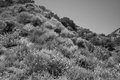
| Too contrasty. I would have liked to see more levels of gray, compared to the white sky and black foreground rocks. |
|
| Photographer found comment helpful. |
|
|
04/28/2010 11:11:52 PM |
| nice shot, if the sky were a little smaller it might accent the coast a bit more? |
|
| Photographer found comment helpful. |
|
|
04/28/2010 01:14:21 AM |
| I think there's too much sky with no discernable detail, which could be cropped and shorten the image by half, and it would still be interesting. |
|
| Photographer found comment helpful. |
|
|
04/27/2010 04:30:26 PM |
| the sky and the water seem to be blown out |
|
| Photographer found comment helpful. |
|
|
04/27/2010 11:28:31 AM |
| for me this sky is way to bright/blown out, and the land is way to dark/lacking details |
|
| Photographer found comment helpful. |
|
|
04/27/2010 03:15:06 AM |
| IMNSHO, this would be a much better shot if you cropped out a lot of that big, blank sky. Also, a large part of the water is blown out. |
|
| Photographer found comment helpful. |
|
|
04/26/2010 05:42:19 PM |
| This looks like beautiful scenery, but much of it is lost in white....a little bit of gray would help bring out those details. Maybe too much contrast? |
|
| Photographer found comment helpful. |
|
|
04/26/2010 04:16:30 PM |
38 Comments side challenge:
I really like this - bold contrast and oodles of negative space really works.
The only bit I'm not keen on is the foreground. I think a slightly tighter crop at the bottom may have stopped this area from dominating. |
|
| Photographer found comment helpful. |
|
|
04/26/2010 01:09:47 PM |
| I don't like the super high contrast edit here. You clearly have an artistic vision and know what you're wanting, the result is just something I don't find personally particularly appealing. |
|
| Photographer found comment helpful. |
|
|
04/26/2010 12:03:48 PM |
| A bit over-done with the contrast for me. |
|
| Photographer found comment helpful. |
|
|
04/26/2010 11:19:12 AM |
| A little too over processed and blown out but, has an artsy look to it |
|
| Photographer found comment helpful. |
|
|
04/26/2010 03:48:47 AM |
| humm little over lighted?? |
|
| Photographer found comment helpful. |
Home -
Challenges -
Community -
League -
Photos -
Cameras -
Lenses -
Learn -
Help -
Terms of Use -
Privacy -
Top ^
DPChallenge, and website content and design, Copyright © 2001-2025 Challenging Technologies, LLC.
All digital photo copyrights belong to the photographers and may not be used without permission.
Current Server Time: 03/10/2025 09:32:17 AM EDT.