| Author | Thread |
Comments Made During the Challenge  |
|
|
12/01/2002 10:23:00 AM |
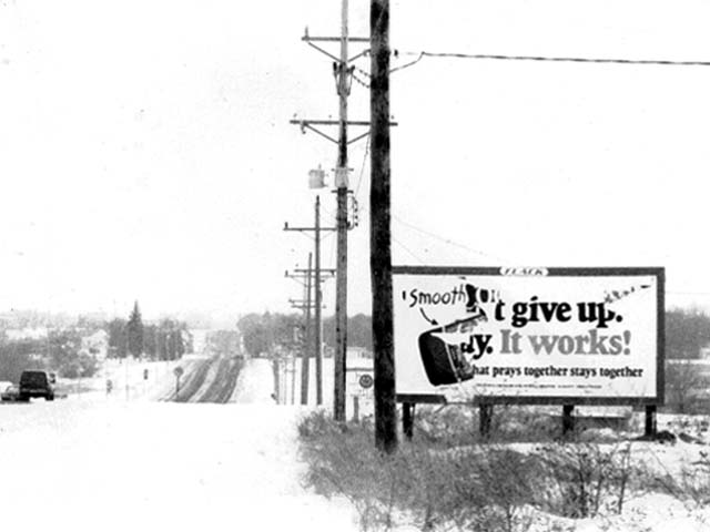
alright. this one i have to think about. it is one of the best photos i have ever seen on this site. the composition and your blatant denial of the rule of thirds works beautifully. the contrast settings and empty feel on the left are awesome. and the billboard saying "give up. it works!" torn from a christian message is so wonderfully bleak. that's either a brilliant subject modification on your part or a really lucky find.
....however. for the life of me, i can't figure out how it fits the challenge. i'm really trying too. it's making me feel stupid. lol. so i'm going to give you the benefit of the doubt, and assume you knew what you were doing, and give you a ten. |
|
|
|
11/30/2002 02:40:00 PM |
| Good image. The high contrast works well. |
|
|
|
11/28/2002 02:05:00 PM |
| Interesting image. The chaos of the billboard makes a good contrast with the serenity of the snowy scene. My only nit here is that the power poles divide the image a little too neatly up the center. I'd have panned just a little more left until the edge of the billboard was up against the R side of the frame. Nicely done. |
|
|
|
11/27/2002 02:34:00 PM |
| I am curious about the choice for b&w here. You seem to lose a lot of the shot in the sky and lower left corner and I wonder if color would have helped there. I am not sure where I should be looking my eyes bounce around too much. Focus could be better. As it is now it is too blured for my taste. |
|
|
|
11/27/2002 01:56:00 AM |
| I am lost. Is this a town??? |
|
|
|
11/26/2002 10:15:00 PM |
Looks over exposed. Background way too hazy. Subject strikes me as so-so.
Jim msp |
|
|
|
11/26/2002 08:25:00 PM |
| The low key approach is beautiful here. I am not sure that it would have a stong enough impact for a newspaper or mag. But the effect is great. |
|
|
|
11/26/2002 03:51:00 PM |
| I cannot imagine that even the Sisseton local paper would print this. Jak 2 |
|
|
|
11/25/2002 10:31:00 PM |
| I realize it is snow, which I love, but it's too bright. Not really in focus. Good idea just needs better execution. Like the sign on the right - Looks like several layers of signs being changed. Where do you have this much snow already? I'm jealous. Maybe if you went with color instead of B&W it would cut down on the brightness. Just my opinion. PTL4 The more i look at it the focus looks worse all the time. |
|
|
|
11/25/2002 02:12:00 PM |
| I think your showing me a snow covered road, it all looks like it's still snowing. Hum, too bad because I'm really just seeing the billboard and the telephone poles. Justine |
|
|
|
11/25/2002 12:35:00 PM |
| I wish this image was less washed out. And it is sort of divided down the middle which is distracting to me. |
|
|
|
11/25/2002 01:51:00 AM |
| Well, if your story is snow then i guess this would work, but it needs people |
|
Home -
Challenges -
Community -
League -
Photos -
Cameras -
Lenses -
Learn -
Help -
Terms of Use -
Privacy -
Top ^
DPChallenge, and website content and design, Copyright © 2001-2025 Challenging Technologies, LLC.
All digital photo copyrights belong to the photographers and may not be used without permission.
Current Server Time: 03/12/2025 04:00:27 PM EDT.