| Author | Thread |
|
|
07/16/2004 10:51:35 AM |
Aloha from the Critique Club!
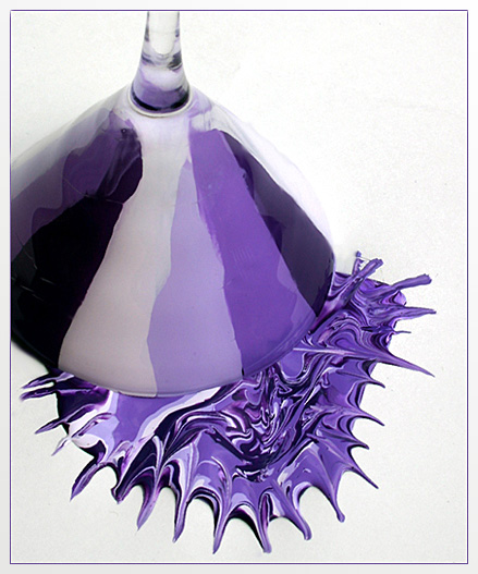
This is a great example of how to create a photograph, rather than trying to find one. You put thought and effort into your composition, and it shows. I like the subtle use of thirds in the placement of the glass, and the shot angle give the image a sense of abstractness.
The focus is mostly very good, but think your depth of field needs to be a little deeper, it would bring the martini glass into full focus, and help sharpen the lines.
Obviously this picture meets the challenge, and as far as the composition of the subject, my only suggestions might be to use one color of purple, and dump the paint from higher up, so the splatter pattern would look more natural. Right now it is more contrived looking.
I like the solid background, though pure white might be better than the textured white. The lightings is unobtrusive and flattering to the subject. I don't care for the frame you chose, it might look better with a solid black bar or no frame at all.
Good job with this entry, keep at it! |
|
 Photographer found comment helpful. Photographer found comment helpful. |
|
|
07/16/2004 09:26:19 AM |
Not from the Critique Club though I did used to be in it so perhaps this will be of help?
Initial thoughts
Colour is lovely and strong, background is mostly a good bright white.
Composition/ Content
Content is interesting but it's not really obvious what one is looking at. The swirly paint "splat" doesn't seem to bear much relation to the neatly painted colour blocks inside the glass so it's not really clear that it's meant to be a spill of paint that was once in the glass. That said it's still interesting in a more abstract way.
Whilst I like the choice of a non-centred composition the choice here doesn't make for a particularly balanced frame to me. Perhaps having the "splat" further to the right might help? I'd also prefer the stem of the glass to be either more accurately vertical or tilted toward the top left corner.
Background
Mostly a good clean white but with some noisy grey smudges to the left side of the frame, both above and below the glass.
Technical
Focus on the glass seems OK though the stem seems a little soft. Exposure look good and colour is lovely and rich.
Fits The Challenge
How could it not?
My Opinion On The Photo
A nice image but not one that wows me or makes me want to look and look again. Partly because of the strange contradiction of neat painting inside the glass and very messy "splat". The splat also looks too artificial. Also partly because the composition just doesn't strike me as very balanced. |
|
| Photographer found comment helpful. |
Comments Made During the Challenge  |
|
|
07/11/2004 11:42:42 PM |
|
| Photographer found comment helpful. |
|
|
07/11/2004 08:47:58 PM |
|
| Photographer found comment helpful. |
|
|
07/11/2004 07:03:25 AM |
| Really beautiful, creative shot for this challenge. It seems like the subject might be better served with brighter lighting instead of the kind of flat light that you used, but it still looks great. Excellent shot! |
|
| Photographer found comment helpful. |
|
|
07/10/2004 01:45:08 PM |
| weird! not too sure what this is supposed to me.. .but its interesting |
|
| Photographer found comment helpful. |
|
|
07/09/2004 03:34:04 PM |
Kinda looks fake. These splash marks wouldn't occur naturally in nature. They must have been dragged out w/a pen or pencil?
I do like the colors, and the mixing of various shades. Lighting is good too. 8 |
|
| Photographer found comment helpful. |
|
|
07/09/2004 03:19:53 PM |
| Splendid, should be in the top 10. |
|
| Photographer found comment helpful. |
|
|
07/09/2004 02:04:08 AM |
| Definitely purple and interesting. Exposure is good - white background sets it off very well. I don't see the need for the border. |
|
| Photographer found comment helpful. |
|
|
07/08/2004 06:22:46 PM |
| I tried something like this too and couldn't get it to work out. This is interesting but not exactly wow. Good idea though |
|
| Photographer found comment helpful. |
|
|
07/08/2004 05:53:12 AM |
| Very striking image I would have given 10 but a little confusing also a little blur on the left side in the black |
|
| Photographer found comment helpful. |
|
|
07/05/2004 02:30:28 PM |
| Weel executer, nice color, perfect studio shot a9 |
|
| Photographer found comment helpful. |
|
|
07/05/2004 02:08:31 PM |
| I like the splash and the different shades of purple on the glass. Works well against a white background. |
|
| Photographer found comment helpful. |
|
|
07/05/2004 10:13:02 AM |
| Very creative. Not so sure I would've cropped so much off the left side. |
|
| Photographer found comment helpful. |
|
|
07/05/2004 02:32:42 AM |
|
| Photographer found comment helpful. |
Home -
Challenges -
Community -
League -
Photos -
Cameras -
Lenses -
Learn -
Help -
Terms of Use -
Privacy -
Top ^
DPChallenge, and website content and design, Copyright © 2001-2025 Challenging Technologies, LLC.
All digital photo copyrights belong to the photographers and may not be used without permission.
Current Server Time: 03/16/2025 05:09:38 AM EDT.