| Author | Thread |
Comments Made During the Challenge  |
|
|
07/13/2004 04:34:38 PM |
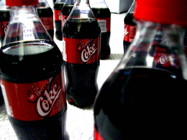
| Sharper focus on left bottle woud've added a point to my vote - I like it. |
|
|
|
07/11/2004 04:09:25 PM |
| This seems rather derrogatory for advertisement. A surplus suggests people aren't buying the product. It's a rather random looking composition although kind of interesting in a weird way. |
|
|
|
07/10/2004 10:59:56 PM |
| MMmmmmm....my favorite... could use one right about now! Good take on the challenge. :o) |
|
|
|
07/10/2004 06:36:27 PM |
| I like the title and the idea, but photo seems too dark. |
|
 Photographer found comment helpful. Photographer found comment helpful. |
|
|
07/10/2004 03:56:20 PM |
| None of the Coke bottles are in good focus, and the brightness levels seem off. I do like the arrangement of the bottles in the photo, though. |
|
| Photographer found comment helpful. |
|
|
07/09/2004 12:58:39 AM |
| Unless you have a low end camera, I'd save the picture at a higher quality. Getting rid of the jpeg artifacts would help a lot. |
|
| Photographer found comment helpful. |
|
|
07/08/2004 08:19:14 PM |
| there is an edge of something up in the top middle. this image is also way too compressed. more definition would increase the score of this photo |
|
|
|
07/08/2004 04:32:50 PM |
| Kind of grainy, but it's still somehow appealing to me! (10) |
|
|
|
07/08/2004 09:57:49 AM |
| Too contrasty. I would want my product to sparkle. These look a little scary. |
|
|
|
07/07/2004 10:10:25 PM |
| Too much blur and strong highlights. Also I don't think the bottle on the right front is helpful to the image. |
|
|
|
07/07/2004 12:00:14 PM |
| This is a good idea, but I'm not really finding a strong focal point. Perhaps a different arrangement, and really emphasize the label? |
|
| Photographer found comment helpful. |
|
|
07/07/2004 04:18:17 AM |
|
|
|
07/07/2004 01:21:33 AM |
| This is a great image, only a 9 due to an overwelming bottle on the right. |
|
| Photographer found comment helpful. |
Home -
Challenges -
Community -
League -
Photos -
Cameras -
Lenses -
Learn -
Help -
Terms of Use -
Privacy -
Top ^
DPChallenge, and website content and design, Copyright © 2001-2025 Challenging Technologies, LLC.
All digital photo copyrights belong to the photographers and may not be used without permission.
Current Server Time: 03/16/2025 11:07:10 PM EDT.