| Author | Thread |
|
|
07/14/2004 08:55:44 AM |
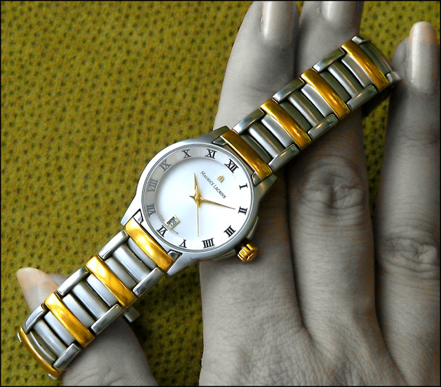
You folks were so right about the background and fingernails and glare!
Thanks for all your comments and votes. I had fun doing this shot and learned that I've aged too much to be a hand model :) |
|
Comments Made During the Challenge  |
|
|
07/13/2004 09:10:22 PM |
| I love the colors, but I find that I dont like the lack of color in the hand. 8 |
|
 Photographer found comment helpful. Photographer found comment helpful. |
|
|
07/13/2004 06:18:04 PM |
| Nice and clear- the nails look kinda weird though, maybe a darker shade of nailpolish would have deepened the contrast there. |
|
| Photographer found comment helpful. |
|
|
07/13/2004 04:29:28 PM |
| Very good - a few more shots might have yielded a bettter exposure of the watch face, earning this a 9+ from this voter |
|
| Photographer found comment helpful. |
|
|
07/13/2004 02:39:11 PM |
| Ahh - the watch itself is superbly displayed and lit. The backgrould would be far better if it were a solid black - this one doesn't do it justice. Your model's fingernail colors don't help a bit. Even with the flaws mentioned - it's an excellent advertisement image. |
|
| Photographer found comment helpful. |
|
|
07/13/2004 01:35:52 PM |
| Beautiful, and well composed. |
|
| Photographer found comment helpful. |
|
|
07/13/2004 09:11:09 AM |
| Liking the techniques used here to desaturate the skin tones, although there are distracting blotches here and there. Also 7-10 o'clock on the watch appear 'smudged' which distracts. |
|
| Photographer found comment helpful. |
|
|
07/10/2004 12:04:28 PM |
| i saw the second hand move. good |
|
| Photographer found comment helpful. |
|
|
07/10/2004 03:18:10 AM |
| the background doesn't go well here |
|
| Photographer found comment helpful. |
|
|
07/08/2004 09:29:54 PM |
| Your desaturation left fuzzy bits of color throughout, nice try, though. |
|
| Photographer found comment helpful. |
|
|
07/08/2004 04:56:06 PM |
| This is beautiful, but is this allowed in basic editing? |
|
| Photographer found comment helpful. |
|
|
07/08/2004 10:54:41 AM |
| Good idea well executed. Background detracts a bit. Just slightly greater DOF to bring fingers into focus would help too. |
|
| Photographer found comment helpful. |
|
|
07/08/2004 02:42:44 AM |
| Overall a good shot, Pity the numbers on the left are kinda fogged over and not sure about the colour of the hand especially the nails! Good background and overall clarity. |
|
| Photographer found comment helpful. |
|
|
07/07/2004 11:14:55 PM |
|
| Photographer found comment helpful. |
|
|
07/07/2004 05:00:40 PM |
| This could be... Not too crazy about the reflections on the gold, like the colors of the image... 8 |
|
| Photographer found comment helpful. |
|
|
07/07/2004 03:26:31 PM |
| Great composition..the watch on the diagonal works very well..superbly lit and very sharp..the desat has let you down a liittle as there is still some colour in the hands and on the nails..but overall the image works very well as an advertisement |
|
| Photographer found comment helpful. |
|
|
07/07/2004 03:11:09 PM |
| This is a nice composition. I'm not sure if that background really works here, and I don't like the ends of the fingernails left in color. |
|
| Photographer found comment helpful. |
|
|
07/07/2004 08:52:18 AM |
| Wow, what a beautiful shot. This could be an actual ad. I think a solid background might help the watch stand out more, but I like the photo as it is as well. Very nice job! |
|
| Photographer found comment helpful. |
|
|
07/07/2004 03:35:34 AM |
| ok that is nice, send me one... demo |
|
| Photographer found comment helpful. |
|
|
07/07/2004 02:10:07 AM |
| The watch looks good but the rest of the photo seems very odd in coloration |
|
| Photographer found comment helpful. |
|
|
07/07/2004 12:43:02 AM |
| Ugh! I *HATE* the color of the background. But I like the idea and the watch is great-looking. |
|
| Photographer found comment helpful. |
|
|
07/07/2004 12:07:11 AM |
| nice shot but dont like the coloring in the fingers... makes them look dirty. |
|
| Photographer found comment helpful. |
Home -
Challenges -
Community -
League -
Photos -
Cameras -
Lenses -
Learn -
Help -
Terms of Use -
Privacy -
Top ^
DPChallenge, and website content and design, Copyright © 2001-2025 Challenging Technologies, LLC.
All digital photo copyrights belong to the photographers and may not be used without permission.
Current Server Time: 03/11/2025 02:03:55 PM EDT.