| Author | Thread |
Comments Made During the Challenge  |
|
|
11/30/2002 05:27:00 PM |
|
|
|
11/29/2002 05:08:00 AM |
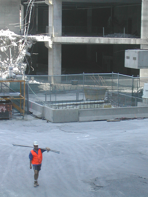
| This whole pic looks a bit fuzzy. I'm not exactly sure what this pic would be representing if put in the paper. I would've concentrating on the demolition work being done on the site and left this guy right out of the pic. I guess I'm not seeing his significance in this picture and if he is significant, then focus on him as the prominent subject - Just my thoughts - Inspzil |
|
 Photographer found comment helpful. Photographer found comment helpful. |
|
|
11/27/2002 09:20:00 PM |
| not quite in focus enough, though the composition's sweet, like the different ways the different parts of the picture are lit. |
|
| Photographer found comment helpful. |
|
|
11/27/2002 01:57:00 AM |
| Very cute. The shot not the guy. |
|
|
|
11/26/2002 09:52:00 PM |
| In the building trade "cowboy" carrys a negative conotation, eg, not legit. Are you saying something about this dude? |
|
| Photographer found comment helpful. |
|
|
11/26/2002 02:27:00 PM |
| This shot seems to have a story to tell. I find it almost ironic that he would wear a hard hat, and work boots and leave his legs exposed. ouch. The orange vest does well at pulling attention to him. that said, I think it might work better if it were possible to crop it so that the man was up and to the right a little, placing him more in the picture and not so close to the edge. Overall, the focus is a little fuzzy, which also makes it difficult to see well. karmat |
|
| Photographer found comment helpful. |
|
|
11/25/2002 09:39:00 PM |
| Image crop is off. Too much building and not enough of the "urban cowboy"...in my humble opinion.... |
|
|
|
11/25/2002 08:48:00 PM |
| I love the use of colours. Jacko 7 |
|
| Photographer found comment helpful. |
|
|
11/25/2002 07:13:00 PM |
I wish I could see a little more of the man. The background isn�t the most interesting and there is very little in the cowboy.
Greg
|
|
| Photographer found comment helpful. |
|
|
11/25/2002 02:44:00 PM |
| excellent eye catcher ! great theme !...8 bullwinkle |
|
|
|
11/25/2002 02:22:00 PM |
| I don't get the title ....unless this is in Dallas, Texas........New stadium? However, I like the shot but not the perspective. 3/4 is uninteresting building,--- and 1/4 is 'the cowboy'. I'm not slamming your work at all.....just that the shot is not clear as to what it's saying. I hope I'm making sense to you. Justine |
|
| Photographer found comment helpful. |
|
|
11/25/2002 12:34:00 AM |
| The color and negative space are super. The sunlight in the upper left is a bit distracting. Good shot!. DPz |
|
| Photographer found comment helpful. |
Home -
Challenges -
Community -
League -
Photos -
Cameras -
Lenses -
Learn -
Help -
Terms of Use -
Privacy -
Top ^
DPChallenge, and website content and design, Copyright © 2001-2025 Challenging Technologies, LLC.
All digital photo copyrights belong to the photographers and may not be used without permission.
Current Server Time: 03/14/2025 01:03:01 AM EDT.