Howdy from the Critique Club!
Flowers are always beautiful, yet somewhat controversial subjects around DPC. Some love them, some hate them. I would imagine that initially, your flower photo suffered from the "not another flower shot" voters. That not withstanding, let's look at it from the technical perspsective.
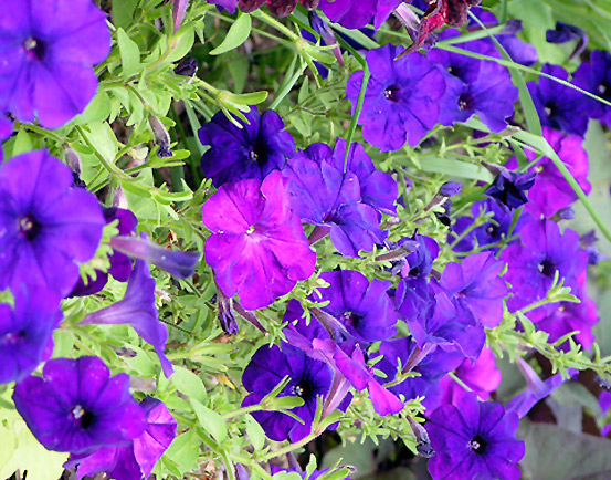
Color: the colors in your image seem quite altered...that is, the purples do seem very saturated in comparison with the greens. This could be attributed to excessive post production or from harsh lighting. Perhaps reshooting in early morning or late afternoon/early evening light would give you a much better and softer light, allowing the true and beautiful colors to shine through. If it was due to processing, backing off the saturation of the blue, red, or magenta channels might help, or a boost of the greens/yellows. At the top in the center, there is a more reddish purple bloom that is distracting colorwise, along with some longer green grass or stems. Cropping tighter in would eliminate that distraction.
Focus: There seems to be a soft focus all the way around the image, with just a little bit rendered more sharply in the center. This, coupled with the lack of a definite, clear, and precise focal point (as in too much for the eyes to take in at once) makes it difficult to appreciate the true beauty of these flowers. The blooms along the left edge that are out of focus and cut off on their edges also stop the eyes. Cropping them out entirely, or recropping with their blooms in entirely, could help.
Composition: Like I said above, the lack of a specific focal point can create some problems...you might reshoot with just fewer blooms at a time, or even one or two. Lead the eyes into a particular place, instead of creating a field of vision that the eye wanders over entirely with no specific place to land.
Challenge: This is definitely a purple image, meeting the challenge in that respect. However, the voters probably found that the flower as a subject was not original enough for their tastes. The technical aspects I've mentioned above also are taken into account during challenge voting, leading the voters to the lower end of the scale.
All in all, the flowers as a subject are nice, but with some adjustments, this shot could be more powerful and quite lovely. If you have any questions, please feel free to contact me through PM...I'm learning, too! :o)
Laurie/CC
|