| Author | Thread |
Comments Made During the Challenge  |
|
|
12/01/2002 08:27:00 PM |
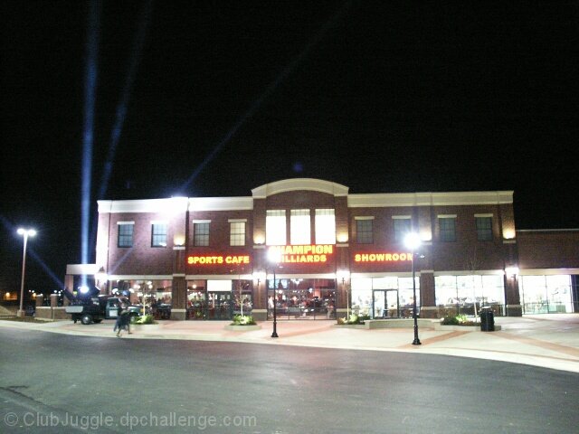
| straighten, crop. the lights are interesting, but the black sky and road would waste a lot of space on a newspaper front page. |
|
 Photographer found comment helpful. Photographer found comment helpful. |
|
|
12/01/2002 06:33:00 AM |
| I know you wanted to get the lights in the shot but there is too much negative space. Especially the road in front. I also have a problem with the light that obliterates the name of the place which should be the focal point. A really good idea that needs just a bit of work, I think. DPz |
|
| Photographer found comment helpful. |
|
|
11/30/2002 09:29:00 PM |
| Needs a lot of the stret and sky cropped off. |
|
| Photographer found comment helpful. |
|
|
11/30/2002 05:19:00 PM |
|
| Photographer found comment helpful. |
|
|
11/30/2002 05:09:00 PM |
| I can remember when "grand openings" were common..mostly car dealerships. takes me back many years. Good job. |
|
| Photographer found comment helpful. |
|
|
11/29/2002 05:05:00 AM |
| This photo needs something, like a thousand people on the outside waiting to get in. As far as grand openings go, this looks more like a regular day. The people being there would make it a whole lot more newspaper worthy - Inspzil |
|
| Photographer found comment helpful. |
|
|
11/27/2002 10:04:00 PM |
| kind of a lot of empty top and bottom, keep on taking long exposures at night though they rule. |
|
| Photographer found comment helpful. |
|
|
11/27/2002 05:32:00 AM |
| Nice idea but too much noise. Lower the ISO and go up a little on the apperture.. |
|
| Photographer found comment helpful. |
|
|
11/26/2002 10:47:00 PM |
Good idea. I think it should have been cropped a little more, though. And you should have slid right a little so the street light did not obscure the name of the place.
Jim msp |
|
| Photographer found comment helpful. |
|
|
11/26/2002 08:23:00 PM |
| Maybe if you'd pulled a little more to the right and gotten the rest of the building the ight wouldn't be right in front of the words. But still a very good night picture. Beautifully lit like it's poseing for you. Makes me want to read the article and see what kind of food they serve and what's in the showroom. Good job. Great photo. Maybe a little soft on the focus - just a little. Crop it closer to the left side, but overall good photo. PTL7 |
|
| Photographer found comment helpful. |
|
|
11/26/2002 09:14:00 AM |
| Exposure was a bit too long. |
|
| Photographer found comment helpful. |
|
|
11/25/2002 11:14:00 PM |
| This looks good, however, I think I tighter crop would make it even better. |
|
| Photographer found comment helpful. |
|
|
11/25/2002 04:50:00 PM |
| Neat idea, and cute little mall. Might of been closer for my liking. Still your on topic. Good eye. Justine |
|
| Photographer found comment helpful. |
|
|
11/25/2002 01:16:00 PM |
| The opening would look more grand from a closer and more dramatic (lower) angle. Plus it looks like no one showed up. |
|
| Photographer found comment helpful. |
|
|
11/25/2002 11:13:00 AM |
|
|
|
11/25/2002 11:09:00 AM |
| doesn't look like much of a grand openning to me... where is every body. No journalisti impact here even though the pic is good. 4 |
|
| Photographer found comment helpful. |
Home -
Challenges -
Community -
League -
Photos -
Cameras -
Lenses -
Learn -
Help -
Terms of Use -
Privacy -
Top ^
DPChallenge, and website content and design, Copyright © 2001-2025 Challenging Technologies, LLC.
All digital photo copyrights belong to the photographers and may not be used without permission.
Current Server Time: 03/12/2025 06:25:51 PM EDT.