| Author | Thread |
Comments Made During the Challenge  |
|
|
07/13/2004 10:40:59 PM |
| Do I turn the magazine sideways to read the label? |
|
|
|
07/08/2004 04:22:52 AM |
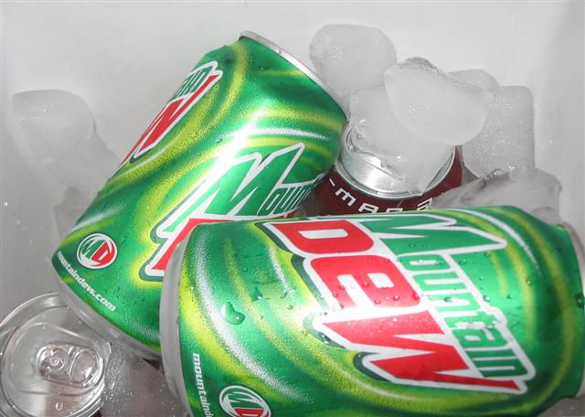
| Good idea but a bit too much glare off the cans and the white background dosen't help it. Maybe difused light would have helped. |
|
|
|
07/07/2004 10:06:51 PM |
| Good concept. Lighting is flat though, with the reflections on the front being too distracting. Also, the ice needs to stand out more from the background. |
|
|
|
07/07/2004 07:34:36 PM |
| One can is obviously not a mountain dew, the one that is dark with the m and a visible. You've got a few water drops on the can, more of this would give a more refreshing feeling. |
|
|
|
07/07/2004 05:15:00 PM |
| I'd try to eliminate the horizontal reflection on the lower front can. The name of the product should be the most important thing so maybe turn the other can our way. |
|
|
|
07/07/2004 01:05:06 AM |
| Has snapshot feel to it, while not a bad idea the structure does not convey the message. |
|
|
|
07/07/2004 12:29:30 AM |
| the flair is a little distracting... |
|
Home -
Challenges -
Community -
League -
Photos -
Cameras -
Lenses -
Learn -
Help -
Terms of Use -
Privacy -
Top ^
DPChallenge, and website content and design, Copyright © 2001-2025 Challenging Technologies, LLC.
All digital photo copyrights belong to the photographers and may not be used without permission.
Current Server Time: 04/27/2025 02:52:23 AM EDT.