| Author | Thread |
|
|
12/09/2002 10:18:19 PM |
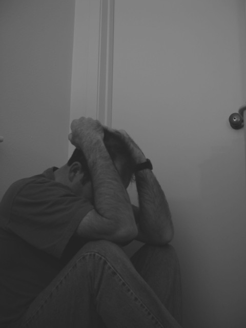
| I think this photo should have done alot better. I like the framing and subject. He could have lost his job or his wife left him. He sure looks like he is feeling blue. There is a tad bit of pink tint to the picture, but I kind of like it because of the effect it gives at the top of the photo. It looks like the stress he is exserting.(sp) |
|
Comments Made During the Challenge  |
|
|
12/08/2002 11:18:42 PM |
| nice composition, and dingy grays. the wall doesn't look straight to me. kinda like it's coming down over his head. which kind of works. 9 |
|
|
|
12/07/2002 07:00:11 PM |
| Needs to be in better focus. Not light enough, Don't like the cropping. Crowded into the bottom left corner. PTL 4 |
|
|
|
12/07/2002 12:31:33 AM |
| This does not have enough contrast -- the color (well, the grays) are all too similar to make this pop out. Also, I would try cropping out the doorknob if possible. It really distracts for some reason. muckpond |
|
|
|
12/06/2002 04:17:02 PM |
| Sorry, Doesn't do much for me |
|
|
|
12/03/2002 11:52:00 PM |
|
|
|
12/02/2002 04:08:00 PM |
| Composition isn't very good, and the balance of white and black is bad. |
|
|
|
12/02/2002 03:58:00 PM |
| Good subject for blue - but you need to zoom in on the person, make it a bit lighter, clearer. |
|
|
|
12/02/2002 03:56:00 PM |
| Wish there was more detail in this photo, I liked the idea and composition |
|
|
|
12/02/2002 05:16:00 AM |
| Is this your rendition of the Poloroid commercial? |
|
|
|
12/02/2002 01:50:00 AM |
| I think that this photo could be improved if you increased the contrast to make the man stand out stronger against the background! |
|
|
|
12/02/2002 01:31:00 AM |
yes! and not a drop of blue in it... perfect
10... my first |
|
|
|
12/02/2002 01:14:00 AM |
| I would have tried pushing up the contrast if possible, it all looks about the same grey to me. I wish you could see the expression on his face, as it is he could have been just sleeping... The little knob on the left I would have tried to crop out, and also, I would have left less blank space at the top. |
|
Home -
Challenges -
Community -
League -
Photos -
Cameras -
Lenses -
Learn -
Help -
Terms of Use -
Privacy -
Top ^
DPChallenge, and website content and design, Copyright © 2001-2025 Challenging Technologies, LLC.
All digital photo copyrights belong to the photographers and may not be used without permission.
Current Server Time: 03/12/2025 03:56:17 PM EDT.