DPChallenge: A Digital Photography Contest You are not logged in. (log in or register
 
Challenge Entries
Portfolio Images
This image is not part of a public portfolio.
"Headin' Down Into The Mystery Below"- John Hartford
smichener


Photograph Information Photographer's Comments
Challenge: Self Portrait VII (Advanced Editing VII)
Camera: Nikon D300
Lens: Nikon AF Micro-Nikkor 105mm f/2.8D
Date: Jun 1, 2010
Aperture: f/8
ISO: 200
Shutter: 1/200
Date Uploaded: Jun 1, 2010


[Jun. 3rd, 2010 01:44:25 PM]

Among the many roles I hold in life, I'm a therapist and a Master Mason. The ring on my finger is a mason's ring. The title of this photograph alludes to these two aspects of my life, and it is the title of a song by John Hartford (Gentle On My Mind, In Tall Buildings, etc). Both therapy and Freemasonry frequently deal with the mysteries of life. It's really not all that deep, but that's what the title is all about.

So far there's been some nice comments. The darkness on my right eye is intentional since we are talking about mystery here. In general I'm pleased with how this self portrait came out.

Statistics
Place: 48 out of 131
Avg (all users): 5.7319
Avg (commenters): 5.7500
Avg (participants): 5.2857
Avg (non-participants): 5.8953
Views since voting: 1193
Views during voting: 420
Votes: 235
Comments: 8
Favorites: 0


Please log in or register to add your comments!

AuthorThread
 Comments Made During the Challenge
06/07/2010 05:18:15 PM
Low power flash fill might lighten the details around eyes.
  Photographer found comment helpful.
06/05/2010 10:50:55 PM
as if deep in conversation
  Photographer found comment helpful.
06/04/2010 01:39:33 PM
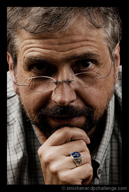
A Mason ring, interesting. I think the light is the issue with this portrait. The most well-lit element is your hand, and I consider that a mistake. It should be your eyes in my view, which are the least well-lit here. The position of your face is affecting where the light falls, or, if this is flash or studio, the lights are not positioned ideally. The right eye is completely "dead" -- not a hint of a catchlight, those areas of reflected light in the eyes that give portraits so much depth, and help the viewer connect with the subject. Lastly, the border is a bit too much -- it does indeed affect the experience of the viewer, and something more restrained, perhaps even coloured subtly to reflect the colours in the photo, would have been ideal. I can see you've tried, though, and so 6.
  Photographer found comment helpful.
06/03/2010 11:42:23 AM
It almost dares me to "discuss" this with you....either that....or NOT to! LOL Interesting shot that tells a story. Love it
  Photographer found comment helpful.
06/03/2010 01:31:39 AM
very prestigious looking
  Photographer found comment helpful.
06/02/2010 10:26:45 PM
the dark shadows in the eye sockets could be improved with some soft light
  Photographer found comment helpful.
06/02/2010 07:00:58 PM
Your right eye is a bit dark, but I like this overall.
  Photographer found comment helpful.
06/02/2010 10:08:11 AM
the black boarder, imo, is just too much; maybe if it were thinner so the eyes wouldn't be so dark
  Photographer found comment helpful.


Home - Challenges - Community - League - Photos - Cameras - Lenses - Learn - Help - Terms of Use - Privacy - Top ^
DPChallenge, and website content and design, Copyright © 2001-2025 Challenging Technologies, LLC.
All digital photo copyrights belong to the photographers and may not be used without permission.
Current Server Time: 03/12/2025 07:58:24 AM EDT.