| Author | Thread |
Comments Made During the Challenge  |
|
|
07/13/2004 12:36:21 AM |
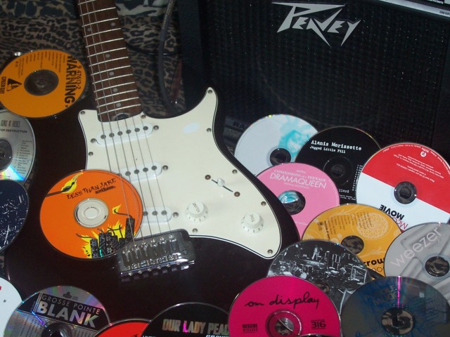
| I don't know, it just doesn't seem to convey what I know you are trying to convey... I think the CDs are just too distracting. |
|
 Photographer found comment helpful. Photographer found comment helpful. |
|
|
07/11/2004 03:07:10 PM |
| nice one, like all the colours |
|
| Photographer found comment helpful. |
|
|
07/11/2004 11:10:15 AM |
| I hope your Less Than Jake CD isn't scratched! |
|
| Photographer found comment helpful. |
|
|
07/08/2004 06:52:44 PM |
| There is a strange glare on the guitar, but other than that, a nice advertisement for a music store. the animal print is kinda nice too because it brings in a little bit of "rockish" feel |
|
| Photographer found comment helpful. |
|
|
07/08/2004 11:39:48 AM |
not enough of the amp in the pic.
Looks like an add for a strat looking reproduction. |
|
| Photographer found comment helpful. |
|
|
07/07/2004 05:25:52 PM |
| Boost the contrast a bit. That would help. |
|
| Photographer found comment helpful. |
|
|
07/07/2004 02:40:15 AM |
| good picture goodluck!!! good composition! |
|
| Photographer found comment helpful. |
Home -
Challenges -
Community -
League -
Photos -
Cameras -
Lenses -
Learn -
Help -
Terms of Use -
Privacy -
Top ^
DPChallenge, and website content and design, Copyright © 2001-2025 Challenging Technologies, LLC.
All digital photo copyrights belong to the photographers and may not be used without permission.
Current Server Time: 04/26/2025 02:45:54 AM EDT.