| Author | Thread |
Comments Made During the Challenge  |
|
|
07/13/2004 10:12:24 PM |
| Light spot takes away from good composition |
|
 Photographer found comment helpful. Photographer found comment helpful. |
|
|
07/11/2004 03:47:12 PM |
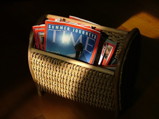
This is a decent composition with good use of available light. It really doesn't say 'advertisement' to me, though. I can't see this being an ad for Time magazine. It doesn't say anything about the product.
It says more about the magazine holder. |
|
| Photographer found comment helpful. |
|
|
07/08/2004 04:05:03 PM |
|
|
|
07/08/2004 01:24:09 AM |
|
| Photographer found comment helpful. |
|
|
07/07/2004 10:52:48 AM |
| It's a nice image, if a bit dark (I know you're going for atmosphere) but I'm not sure this would appeal as an ad for Time. The reds on the borders of the mags blend together a bit, but otherwise the focus is good, nice weave detail. Would the target audience for Time respond to this ad though? |
|
| Photographer found comment helpful. |
Home -
Challenges -
Community -
League -
Photos -
Cameras -
Lenses -
Learn -
Help -
Terms of Use -
Privacy -
Top ^
DPChallenge, and website content and design, Copyright © 2001-2025 Challenging Technologies, LLC.
All digital photo copyrights belong to the photographers and may not be used without permission.
Current Server Time: 03/12/2025 12:08:54 PM EDT.