| Author | Thread |
Comments Made During the Challenge  |
|
|
07/13/2004 10:57:20 PM |
| Maybe the addition of a rag or other article would have added some interest? |
|
 Photographer found comment helpful. Photographer found comment helpful. |
|
|
07/13/2004 03:31:58 PM |
|
| Photographer found comment helpful. |
|
|
07/13/2004 12:03:32 PM |
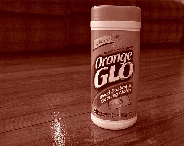
| the refledtion on the floor indeed makes the wood glow. Nice idea. Needs to be rotated a bit CCW. |
|
| Photographer found comment helpful. |
|
|
07/12/2004 03:47:32 AM |
| Don't really like the sepia tone |
|
| Photographer found comment helpful. |
|
|
07/11/2004 03:00:38 PM |
| Duotone doesn't seem appropriate for this. Because of the name of the product, we really should see some orange (presumably in the label). The composition isn't bad. The product is a bit tilted. |
|
| Photographer found comment helpful. |
|
|
07/11/2004 10:44:47 AM |
| I dont think having the photograph all the same tone does it justice. |
|
| Photographer found comment helpful. |
|
|
07/10/2004 06:00:43 PM |
| I'm not sure I like the color tones in this photo. I would at least maintain the natural colors of the Orange Glo container, or give the whole photo a more saturated orange look to it. Great concept and angle, though. |
|
| Photographer found comment helpful. |
|
|
07/09/2004 10:59:45 AM |
| Would have been better if not in sepia. |
|
| Photographer found comment helpful. |
|
|
07/08/2004 06:56:47 PM |
| An advertisement for orange glo should probably have some vivid orange in it. So I'm not much for the color of the picture, but the setting is nice. |
|
| Photographer found comment helpful. |
|
|
07/08/2004 04:23:49 PM |
|
| Photographer found comment helpful. |
|
|
07/08/2004 03:52:41 AM |
Should have made it more......well...orange
|
|
| Photographer found comment helpful. |
|
|
07/07/2004 11:34:05 PM |
| ...not sure why you took the colour out?? |
|
| Photographer found comment helpful. |
|
|
07/07/2004 06:24:07 PM |
| Dont really like the sepia tone here. Takes away from what the product is supposed to accomplish. |
|
| Photographer found comment helpful. |
|
|
07/07/2004 04:29:15 PM |
| It looks like there is some dust or smudges right in front of the container. Otherwise it's a nice shot. |
|
| Photographer found comment helpful. |
|
|
07/07/2004 11:34:26 AM |
| Why duotone? You want people to identify your brand in the store, so make sure it looks the way it will when they go to the store. Nice wood grain. |
|
| Photographer found comment helpful. |
|
|
07/07/2004 10:37:10 AM |
| I think it would have been better full color. |
|
| Photographer found comment helpful. |
|
|
07/07/2004 02:39:15 AM |
| this is a gr8 picture goodluck! |
|
| Photographer found comment helpful. |
|
|
07/07/2004 01:52:35 AM |
| I like the colour. Probably I never see an advertisement in sepia, but I really love your pic... 7 |
|
| Photographer found comment helpful. |
|
|
07/07/2004 01:08:46 AM |
| Too bad the hue isn't orangeish!!! |
|
| Photographer found comment helpful. |
Home -
Challenges -
Community -
League -
Photos -
Cameras -
Lenses -
Learn -
Help -
Terms of Use -
Privacy -
Top ^
DPChallenge, and website content and design, Copyright © 2001-2025 Challenging Technologies, LLC.
All digital photo copyrights belong to the photographers and may not be used without permission.
Current Server Time: 03/14/2025 11:45:03 AM EDT.