| Author | Thread |
|
|
09/28/2005 09:32:12 AM |
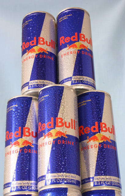
| The photo seem tilted but I like the concept. Nice try at lighting. |
|
 Photographer found comment helpful. Photographer found comment helpful. |
|
|
08/02/2004 09:19:34 AM |
Kavey Critique
Initial thoughts
Viewpoint is unusual but overall image seems very tilted.
Composition/ Content
As above, the tilt does make this look less professional and could have been corrected with a small rotation of the image followed by a crop. The colours are vivid which is appealing and the water droplets do add interest but there isn't really a focal point for me - where should my eye end up?
Background
I like that it's not completely flat yet doesn't distract from the subject.
Technical
Lighting seems harsh - perhaps diffusing the light source with a white cloth or tissue might help.
Fits The Challenge
Yes, though it seems more a case of showing me the product than really selling it's qualities.
My Opinion On The Photo
An acceptable image but one that could be improved a great deal by a few simple changes to lighting and rotation. That said, content does lack "punch".
|
|
| Photographer found comment helpful. |
Comments Made During the Challenge  |
|
|
07/13/2004 09:19:22 PM |
| Sloppy framing distracts from product/brand focus. |
|
|
|
07/13/2004 09:21:36 AM |
| Right idea with the water droplets on cans - reds in red bull a bit orangey, dull background. |
|
| Photographer found comment helpful. |
|
|
07/10/2004 07:39:10 PM |
|
| Photographer found comment helpful. |
|
|
07/09/2004 05:03:19 PM |
Your lines tilt to the left. Hard to control that..mostly done with camera angle and
lens. |
|
| Photographer found comment helpful. |
|
|
07/08/2004 08:15:37 PM |
| the light part of the cans blends in too much with the background. the top two cans look great, but too much of a relection in the bottom ones. It would also help if the picture was level. |
|
| Photographer found comment helpful. |
|
|
07/08/2004 06:36:27 AM |
| Doesn't sell me. My eye keeps wandering to the top right corner where a section of your background paper was puckered and created a shadow. This says 'stack of cans' more than 'monument' to me. It might have been more effective to use just one can with a wide angle lens and really sharp focus. This is just kind of dull. |
|
|
|
07/07/2004 07:42:04 PM |
| If the background was lit a little bit brighter, it'd create a very appealing contrast. |
|
| Photographer found comment helpful. |
|
|
07/07/2004 07:10:05 PM |
| Nice concept. Good shot. I like how you've got all the waterdrops on the cans. It really emphasizes the idea of refreshing. |
|
| Photographer found comment helpful. |
|
|
07/07/2004 04:46:04 AM |
|
|
|
07/07/2004 01:44:45 AM |
| I really like it. Good focus and good composition... 7 |
|
| Photographer found comment helpful. |
Home -
Challenges -
Community -
League -
Photos -
Cameras -
Lenses -
Learn -
Help -
Terms of Use -
Privacy -
Top ^
DPChallenge, and website content and design, Copyright © 2001-2025 Challenging Technologies, LLC.
All digital photo copyrights belong to the photographers and may not be used without permission.
Current Server Time: 03/12/2025 05:32:34 PM EDT.