| Author | Thread |
Comments Made During the Challenge  |
|
|
07/13/2004 05:09:13 PM |
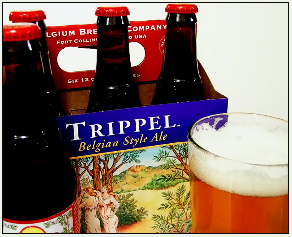
| Hmmm... Beer. This is a nice shot. Not to busy, not to pushy. It's just right. In fact, I am seriously considering checking with my local "eccentric" liquor store to see if they carry this... If one DPC'er likes it, I am sure it has to be good... |
|
 Photographer found comment helpful. Photographer found comment helpful. |
|
|
07/13/2004 04:18:51 PM |
| Not enough product/brand definition |
|
| Photographer found comment helpful. |
|
|
07/09/2004 05:19:54 PM |
| Too tight. Overexposed...lose detail in the suds on the beer. |
|
| Photographer found comment helpful. |
|
|
07/09/2004 12:09:47 AM |
| I love the title. At first I thought you were a bad speller--very clever. |
|
| Photographer found comment helpful. |
|
|
07/08/2004 08:18:53 PM |
| Nice shot , made me thirsty, shame the two bottles on the left wern't a bit more defined. Well done |
|
| Photographer found comment helpful. |
|
|
07/08/2004 10:42:39 AM |
| Good idea. Good focus and DOF. Bollte glass is pretty dark. A bit more light and you could have had some nice refraction stuff going on. I like the title and how it serves as a tag line for the ad. Pure white background detracts a bit. Some kind of gradient or backdrop would have helped or maybe a Tyrolian scene. |
|
| Photographer found comment helpful. |
|
|
07/07/2004 11:22:12 PM |
| Make sure the foam is to the top of the glass. but I like the title |
|
| Photographer found comment helpful. |
|
|
07/07/2004 09:47:06 PM |
| The shadow on the bottle to the left is a little harsh. It's hard to tell where the bottle ends and the shadow begins along the blue section and where the bottle behind it is located. There is no real separation between the two. |
|
| Photographer found comment helpful. |
|
|
07/07/2004 09:36:06 PM |
| I like the concept of the title and photo. I wish the background was a bit darker. From my perspective, it seems to wash out the main aspects of the photo. |
|
| Photographer found comment helpful. |
|
|
07/07/2004 04:32:07 AM |
| outstanding pic and presentation... |
|
| Photographer found comment helpful. |
|
|
07/07/2004 01:05:23 AM |
| Great colour, however is a bit unstructured. |
|
| Photographer found comment helpful. |
|
|
07/07/2004 12:22:31 AM |
| I like the connection of title and product. The exposure is good, but the composition may be improved by showing more of the bottle on the left to show the full label (7) |
|
| Photographer found comment helpful. |
Home -
Challenges -
Community -
League -
Photos -
Cameras -
Lenses -
Learn -
Help -
Terms of Use -
Privacy -
Top ^
DPChallenge, and website content and design, Copyright © 2001-2025 Challenging Technologies, LLC.
All digital photo copyrights belong to the photographers and may not be used without permission.
Current Server Time: 03/12/2025 01:44:15 PM EDT.