| Author | Thread |
|
|
12/10/2002 11:58:46 PM |
Originally posted by Natasha:
Critique by Natasha for the Critique club
CONTENT- COMPOSITION
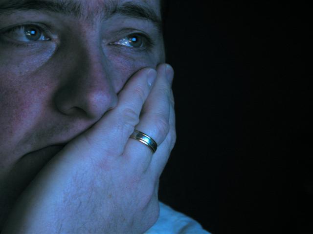
You have captured the feeling off blue well here, theres no mistaking the emotion. Drawn to the sadness of the eyes and the downturned mouth adds to the effect. For some reason, I find the wedding ring a bit distracting (maybe cause I just got married and feel it doesnt relate to blue!) Composition is good and I like the placement of the face, could possibly be moved slightly to the right, to include the edge of the left eye and the head placed slightly lower in the frame, cropping off a bit of the hand.
TECHNICAL -CAMERA
I like the blue tint that you have used, some of your comments say that it is a bit dark, but I think its fine, however the lighting on the hand is a bit brighter than the face, so this could be evened out a bit.
MY OPINION
You did a great job here of capturing the emotion of blue and I give you credit for trying this, most of us took the easier route and photographed something blue. Focus could be a bit sharper overall, to give it a bit more impact. Great job and I hope that you find this critique helpful. |
I do. Thank you for taking the time to be so thorough with this. I agree with most of your comments. |
|
|
|
12/10/2002 10:19:27 AM |
Critique by Natasha for the Critique club
CONTENT- COMPOSITION
You have captured the feeling off blue well here, theres no mistaking the emotion. Drawn to the sadness of the eyes and the downturned mouth adds to the effect. For some reason, I find the wedding ring a bit distracting (maybe cause I just got married and feel it doesnt relate to blue!) Composition is good and I like the placement of the face, could possibly be moved slightly to the right, to include the edge of the left eye and the head placed slightly lower in the frame, cropping off a bit of the hand.
TECHNICAL -CAMERA
I like the blue tint that you have used, some of your comments say that it is a bit dark, but I think its fine, however the lighting on the hand is a bit brighter than the face, so this could be evened out a bit.
MY OPINION
You did a great job here of capturing the emotion of blue and I give you credit for trying this, most of us took the easier route and photographed something blue. Focus could be a bit sharper overall, to give it a bit more impact. Great job and I hope that you find this critique helpful. |
|
|
|
12/10/2002 12:28:52 AM |
Originally posted by Wes:
I get that look on my face when I get a blue screen in Windows too :-P good use of the black space in the picture, though I'd like to see the cropping include a little more of the face, and perhaps hair? |
No.... this is the face I make when I get that screen
My Face Image Here |
|
Comments Made During the Challenge  |
|
|
12/08/2002 04:03:31 PM |
| What do you have to feel blue about, you're married, you've concured the unconcorable obstacle to life's happiness. If you're so sad, go kiss your wife and tell her how lucky you are to have her and how much you love her. |
|
|
|
12/07/2002 08:51:26 PM |
| This is a good one. I want to cry just looking at the sadness in his eyes. This is what a photo is supposed to do in this challenge. Cause me to feel something and this one does. Technically everything is right on. Love the soft focus. May be a little dark but not enough to really hurt it. Just a thought. Good job. PTL 9 |
|
|
|
12/07/2002 02:35:40 PM |
| This guy looks like he is watching surgeons operate on his wife through a medical theater. Good shot. Nice story. |
|
|
|
12/02/2002 10:11:00 PM |
| looks like you are too close to a tv. doesn't work for me, looks put on. |
|
|
|
12/02/2002 06:56:00 PM |
| Great expression and color. The focus is a bit soft for my liking...but this is a job well done. Justine |
|
|
|
12/02/2002 04:35:00 PM |
|
|
|
12/02/2002 10:52:00 AM |
For me the best picture to the expression "blue".
The light on the face could have beena little brighter though |
|
|
|
12/02/2002 12:33:00 AM |
| I like the blueish tint you gave him to help evoke the color blue... and he definitely doesn't look happy. Nice job, and I like the blank space that he has staring off. Only thing I would say you might want to keep in mind next time is the hot spot on his ring... it is distracting. Nice job though and good luck! |
|
|
|
12/02/2002 12:23:00 AM |
| I get that look on my face when I get a blue screen in Windows too :-P good use of the black space in the picture, though I'd like to see the cropping include a little more of the face, and perhaps hair? |
|
Home -
Challenges -
Community -
League -
Photos -
Cameras -
Lenses -
Learn -
Help -
Terms of Use -
Privacy -
Top ^
DPChallenge, and website content and design, Copyright © 2001-2025 Challenging Technologies, LLC.
All digital photo copyrights belong to the photographers and may not be used without permission.
Current Server Time: 03/13/2025 02:53:25 AM EDT.