| Author | Thread |
Comments Made During the Challenge  |
|
|
07/11/2010 03:45:40 PM |
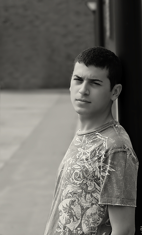
A good portrait but there's too little noise. It needs some texture.
Back for a second look. Bumping it up a point or two. It's starting to click with me. I was initially troubled by the too smooth looking skin and hair -- like maybe you applied too much noise reduction. But I'm not sure that's what's going on now. What I find most effective is his placement in the frame against that plain blurred background. |
|
 Photographer found comment helpful. Photographer found comment helpful. |
|
|
07/05/2010 12:28:06 PM |
| There's quite a bit of void space above his head. Not sure why you didn't crop it off to bring the viewer right into his expression. |
|
| Photographer found comment helpful. |
|
|
07/05/2010 06:29:58 AM |
| It looks like you've smoothed his skin, I have to say I would have preferred seeing this in a grunge look, even your model's shirt looks grungy. But then again thats just me :D |
|
| Photographer found comment helpful. |
|
|
07/05/2010 03:16:08 AM |
| too much noise reduction. |
|
| Photographer found comment helpful. |
|
|
07/05/2010 12:26:42 AM |
| tighter crop would be better... |
|
| Photographer found comment helpful. |
Home -
Challenges -
Community -
League -
Photos -
Cameras -
Lenses -
Learn -
Help -
Terms of Use -
Privacy -
Top ^
DPChallenge, and website content and design, Copyright © 2001-2025 Challenging Technologies, LLC.
All digital photo copyrights belong to the photographers and may not be used without permission.
Current Server Time: 03/10/2025 07:22:07 PM EDT.