| Author | Thread |
Comments Made During the Challenge  |
|
|
07/20/2010 11:01:00 PM |
|
 Photographer found comment helpful. Photographer found comment helpful. |
|
|
07/20/2010 03:13:57 PM |
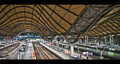
| Nice save by adding the reflections in your title. As the picture goes, the reflections are distracting, and I think it would look nicer if you could bring more detail out of the brick. |
|
| Photographer found comment helpful. |
|
|
07/18/2010 04:12:21 PM |
| Too many! Really well done! |
|
| Photographer found comment helpful. |
|
|
07/17/2010 03:20:03 PM |
| pitty about the shadows. A colour only crop would also have looked super |
|
| Photographer found comment helpful. |
|
|
07/15/2010 09:44:52 PM |
| Probably shouldn't forget about the bricks too. I'll keep an eye on this after the challenge to see if anyone got it right. |
|
| Photographer found comment helpful. |
|
|
07/15/2010 08:14:45 AM |
| I'm not even going to try. |
|
| Photographer found comment helpful. |
|
|
07/15/2010 06:22:30 AM |
| Or the bricks! My answer is many many. |
|
| Photographer found comment helpful. |
|
|
07/14/2010 10:34:30 PM |
| I like the composition and subject. The shadows really throw the image off for me though. Otherwise, I like it... |
|
| Photographer found comment helpful. |
|
|
07/14/2010 05:30:22 PM |
I'm not counting all those :p
+Nice colours
+Lots of rectangles
-Boring composition
-Not straight, definitely tilted to one side |
|
| Photographer found comment helpful. |
|
|
07/14/2010 09:25:05 AM |
| I like how the title challenges you to look more closely. |
|
| Photographer found comment helpful. |
|
|
07/14/2010 08:58:16 AM |
| ummmmm not the best I've seen here.. |
|
Home -
Challenges -
Community -
League -
Photos -
Cameras -
Lenses -
Learn -
Help -
Terms of Use -
Privacy -
Top ^
DPChallenge, and website content and design, Copyright © 2001-2025 Challenging Technologies, LLC.
All digital photo copyrights belong to the photographers and may not be used without permission.
Current Server Time: 03/15/2025 04:14:19 AM EDT.